1882 The Bradbury Wilkinson Letter Design + ABNCo!

Sellos impresos por la American Bank Note Co. y la National Bank Note Co. de New York a partir de 1867.
Responder
Avatar de Usuario
Rein
Usuario Colaborador
Usuario Colaborador
Mensajes: 6258
Registrado: 13 Mar 2009 15:59
Ubicación: Leiden, Netherlands
Contactar:

1882 The Bradbury Wilkinson Letter Design + ABNCo!

Mensaje por Rein »

The 1882 Letter design stamps of 1/2c, 1c and 12c had been printed in typography by the English Printing House - Bradbury Wilkinson, New Malden.

An adapted design was issued in 1884 and printed by the American Bank Note Company, New York....

Our catalogue M.T. carefully copying what had been written before -

Imagen

- only mentions a few stamps!

Is that really all there is????
Avatar de Usuario
Rein
Usuario Colaborador
Usuario Colaborador
Mensajes: 6258
Registrado: 13 Mar 2009 15:59
Ubicación: Leiden, Netherlands
Contactar:

Re: 1882 The Bradbury Wilkinson Letter Design + ABNCo!

Mensaje por Rein »

The stamps pictured in M.T. are the typographed stamps by Bradbury Wilkinson. Count the numbers of "holes" in the top line of the frame: 19 for BW, 33 for ABNCO. The 1885 stamps had been printed in recess by ABNCo and UNLIKE what the ""Id. Grabados" suggests the designs of the 1882 set and the 1884 set are completely different!

The 1/2c typo:

Imagen

The 1/2c recess:

Imagen

to be continued.....
Última edición por Rein el 26 Jun 2009 19:28, editado 1 vez en total.
Avatar de Usuario
Rein
Usuario Colaborador
Usuario Colaborador
Mensajes: 6258
Registrado: 13 Mar 2009 15:59
Ubicación: Leiden, Netherlands
Contactar:

Re: 1882 The Bradbury Wilkinson Letter Design + ABNCo!

Mensaje por Rein »

The 1c typo:

Imagen

The 1c recess:

Imagen

to be continued.....
Avatar de Usuario
Rein
Usuario Colaborador
Usuario Colaborador
Mensajes: 6258
Registrado: 13 Mar 2009 15:59
Ubicación: Leiden, Netherlands
Contactar:

Re: 1882 The Bradbury Wilkinson Letter Design + ABNCo!

Mensaje por Rein »

The 12c typo:

Imagen

The 12c recess by ABNCo:

Imagen

to be continued.....
Avatar de Usuario
Rein
Usuario Colaborador
Usuario Colaborador
Mensajes: 6258
Registrado: 13 Mar 2009 15:59
Ubicación: Leiden, Netherlands
Contactar:

Re: 1882 The Bradbury Wilkinson Letter Design + ABNCo!

Mensaje por Rein »

However, the 12c does exist in 2 different variants:

- typographed by Bradbury Wilkinson
- recess printed by Bradbury Wilkinson

If you pay attention to the details you see why! And don't bother about the quality of my stamps!

The 12c typo:

Imagen

The 12c recess by BW:

Imagen

in details:

typo:

Imagen

recess:

Imagen

typo:

Imagen

recess:

Imagen
Avatar de Usuario
Rein
Usuario Colaborador
Usuario Colaborador
Mensajes: 6258
Registrado: 13 Mar 2009 15:59
Ubicación: Leiden, Netherlands
Contactar:

Re: 1882 The Bradbury Wilkinson Letter Design + ABNCo!

Mensaje por Rein »

From an auction by Liane and Sergio Sismondo - The Classic Collector - Argentina Specialist - L0378:

Imagen

Scott #54. "Sun and letter" 12 centavos, BradburyWilkinson imperforated proof struck in yellow green and perforated "SPECIMEN" affixed to card, which is a portion of a trade sample book. Superb and Very Rare. Fewer than 5 can exist.
Avatar de Usuario
Rein
Usuario Colaborador
Usuario Colaborador
Mensajes: 6258
Registrado: 13 Mar 2009 15:59
Ubicación: Leiden, Netherlands
Contactar:

Re: 1882 The Bradbury Wilkinson Letter Design + ABNCo!

Mensaje por Rein »

Coming up with a better copy of the recess BW 12c Sobrecito!

Imagen

detail of my first copy:

Imagen

detail of my 2nd copy:

Imagen

in typo a practical joker in those days?:

Imagen
Avatar de Usuario
Rein
Usuario Colaborador
Usuario Colaborador
Mensajes: 6258
Registrado: 13 Mar 2009 15:59
Ubicación: Leiden, Netherlands
Contactar:

Re: 1882 The Bradbury Wilkinson Letter Design + ABNCo!

Mensaje por Rein »

I started a separate web-page for this issue and will modify this whenever I have found new details and facts published here:


http://www.galeoptix.nl/fila/arg_1882.htm
Avatar de Usuario
Rein
Usuario Colaborador
Usuario Colaborador
Mensajes: 6258
Registrado: 13 Mar 2009 15:59
Ubicación: Leiden, Netherlands
Contactar:

Re: 1882 The Bradbury Wilkinson Letter Design + ABNCo!

Mensaje por Rein »

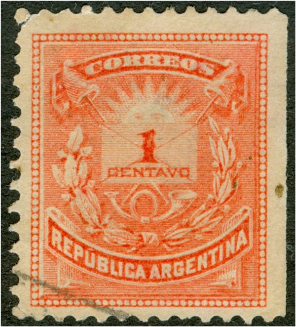
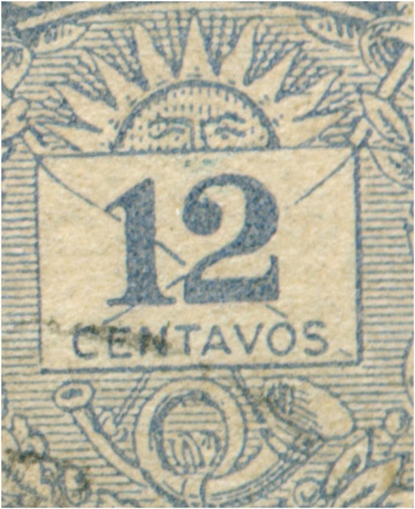
This much neglected stamp has been the subject of a long tradition of philatelists NOT using their eyes or magnifying glasses but having an unbroken belief in what has been written in successive catalogues for more than 120 years now from one copy-cat to another:

Imagen

Imagen

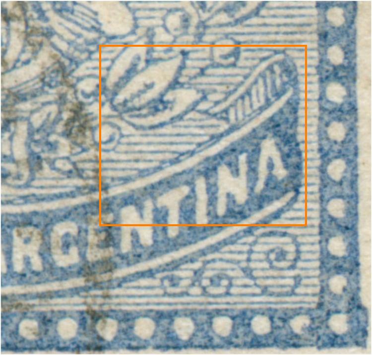
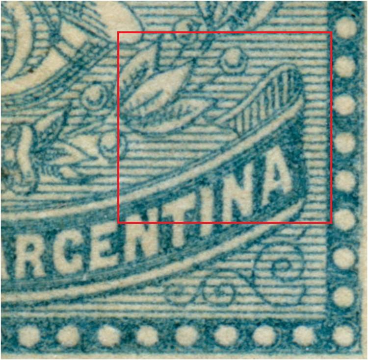
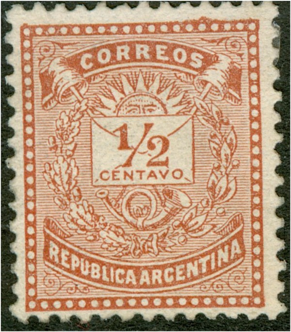
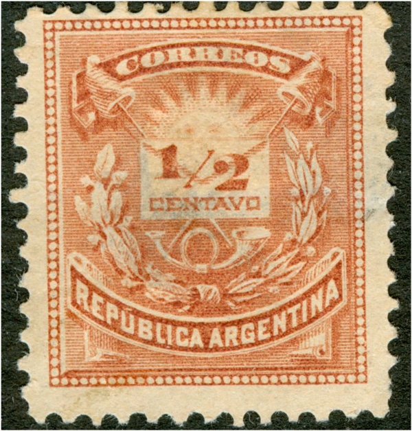
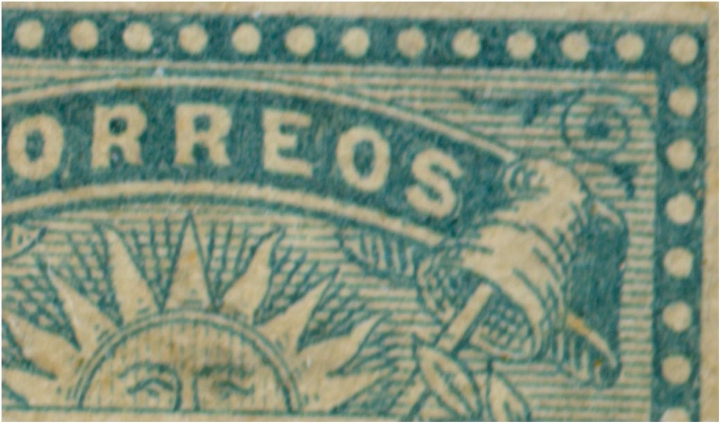
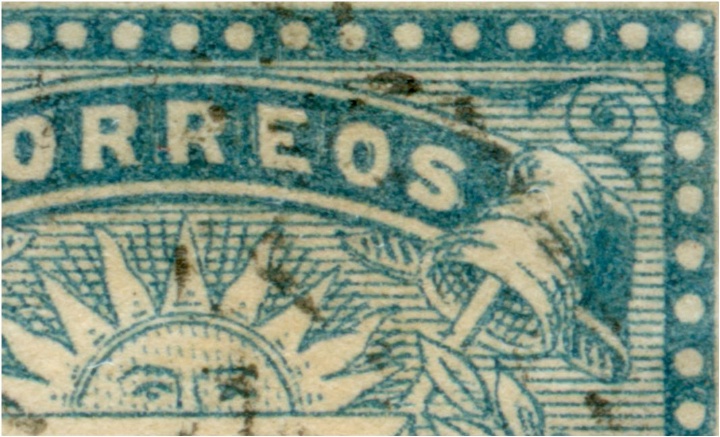
Can we not see the delicate lines of engraving in the scroll of "Argentina" and the nerves of the leaves ?

Imagen

Imagen

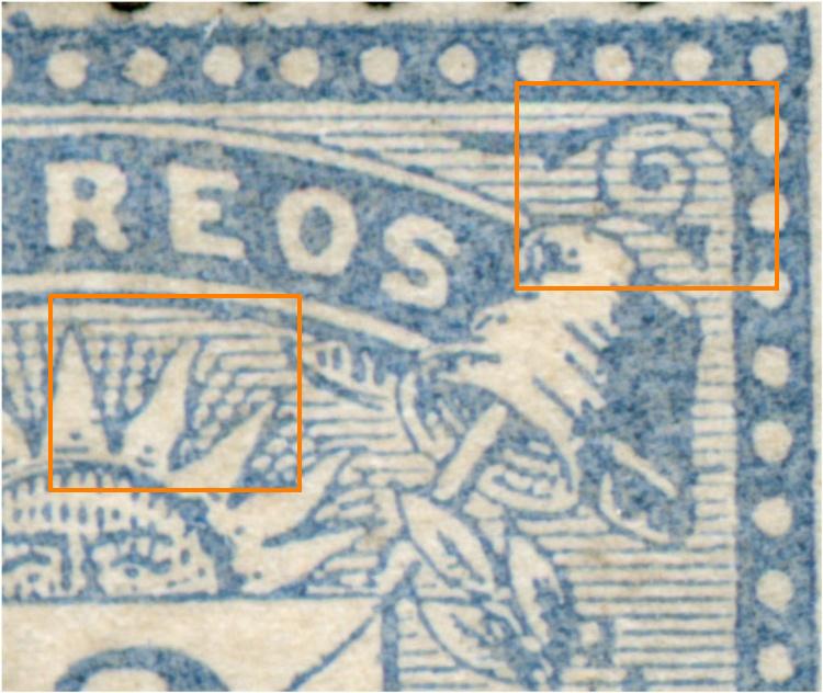
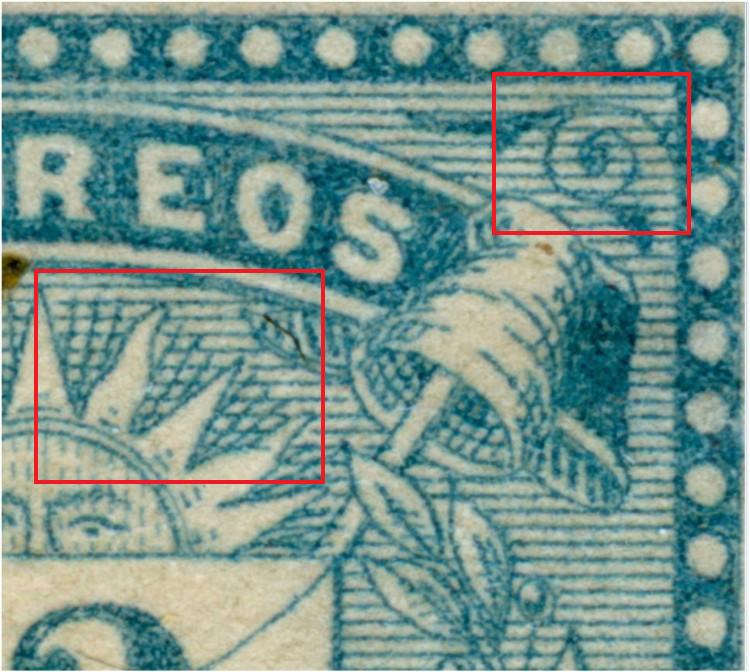
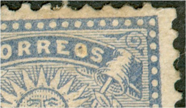
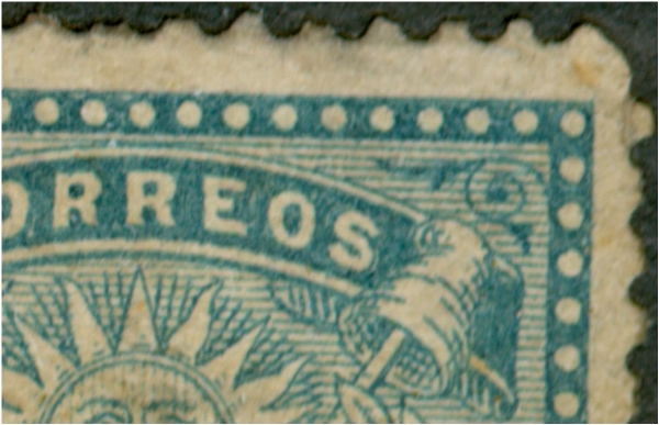
Can we not see the first horizontal line not touching the branch in the upper right corner??? or the delicate parallelogrammes in between the sun-rays??

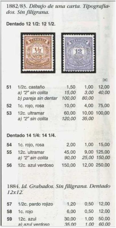
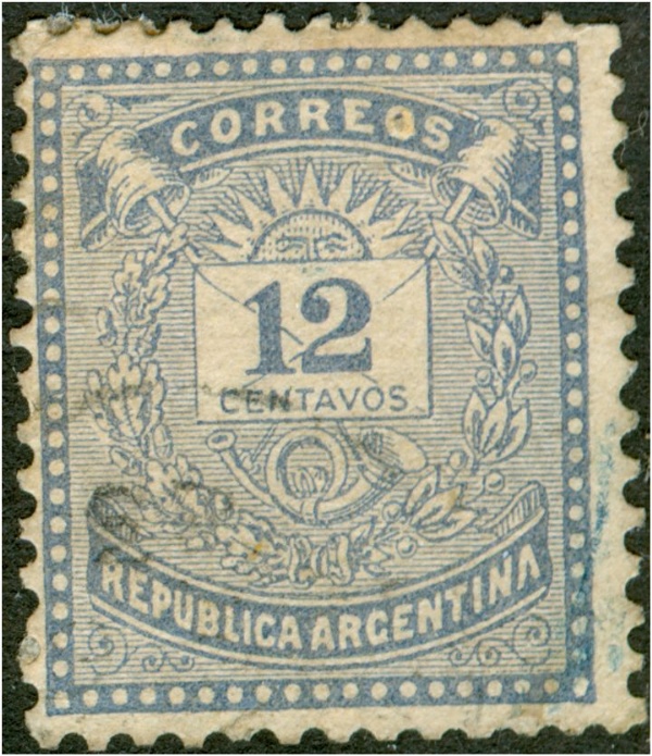
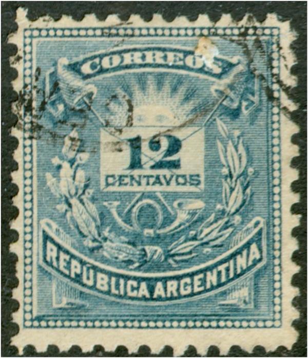
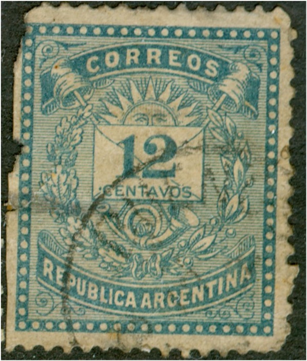
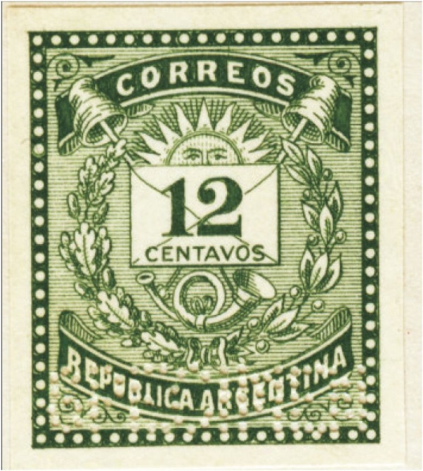
In the GJ '09 catalogue on the pages 55-57 we find the "Dibujo de una carta" typographed by Bradbury Wilkinson, London; the numbers 63+65 refer to the 12c ultramar that is to have the "sin colita" in 10 out of the 100 stamps of a sheet.

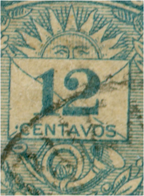
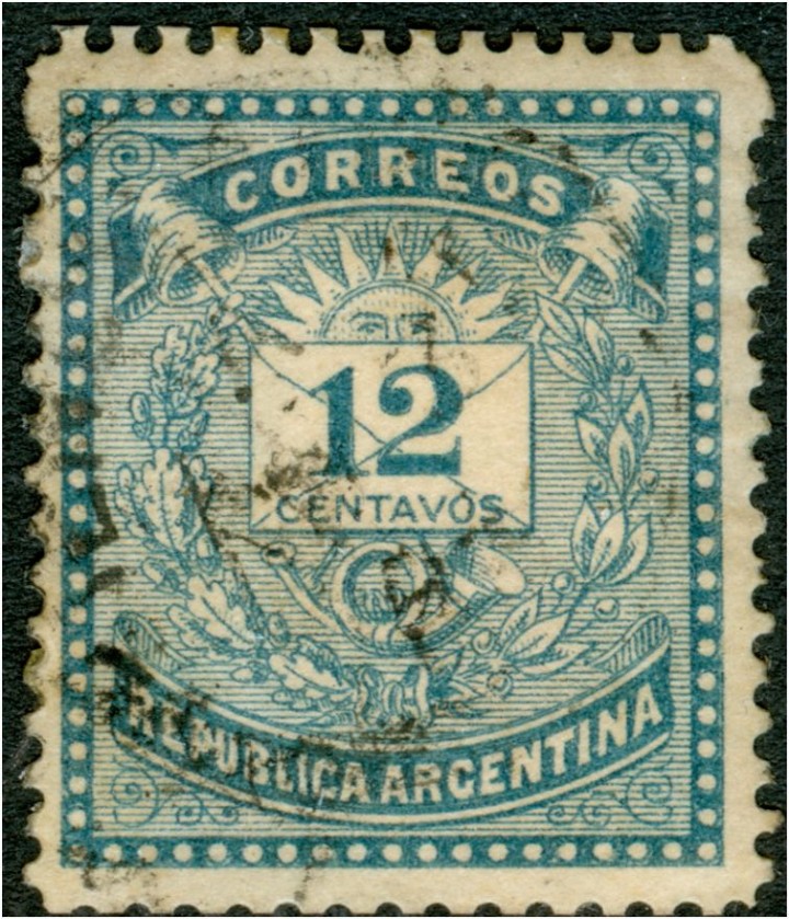
If the number 66 12c azul verdoso would be just a different colour, the use of a different ink whilst still with the same plates, the colita would be there as well. And of course there would NOT be the pointed-out above differences, wouldn't it??

Even if you can not belief that the azul verdoso was printed in recess by Bradbury Wilkinson; and even if you can not find evidence in the Archives, then still the many differences in design between the 12c ultramar and the 12c azul verdoso deserve to be mentioned....

GOOGLE:

Este sello se ha descuidado mucho el tema de una larga tradición de filatelistas no utilicen sus ojos o lentes de aumento, pero tienen una fe inquebrantable en lo que se ha escrito en los sucesivos catálogos de más de 120 años de una copia gato a otro:

¿No podemos ver las líneas delicadas de grabado en el rollo de "Argentina" y los nervios de las hojas?

¿No podemos ver la primera línea horizontal sin tocar la rama en la esquina superior derecha??? o la parallelogrammes delicatwe entre los rayos del sol??

En el '09 Catálogo de GJ en las páginas 55-57 se encuentra el "Dibujo de una carta" tipografiado por Bradbury Wilkinson, de Londres, en los números 63 65 se refieren a la ultramar 12c que es tener la "sin colita" en 10 de los 100 sellos de la hoja.

Si el número 66 12c azul verdoso sería sólo un color diferente, el uso de una tinta diferente, mientras sigue con las mismas placas, la colita estaría allí también. Y, por supuesto, no sería el señalado anteriormente-las diferencias, ¿no??

Incluso si usted no puede creer que el azul verdoso fue impreso en receso por Bradbury Wilkinson, e incluso si usted no puede encontrar pruebas en los archivos, entonces todavía muchas diferencias en el diseño de Ultramar entre el 12C y 12c azul verdoso merecen ser mencionadas ....
Avatar de Usuario
villa56
Usuario Colaborador
Usuario Colaborador
Mensajes: 1905
Registrado: 30 Oct 2009 14:44
Colecciono: Argentina. Primera serie de Próceres. Matasellos.
Alemania. Todo Germania (1900-1920). Incluido ocupaciones WWI, oficinas, etc.
Canje de Sellos: Si
Ubicación: Ourense. España
Contactar:

Re: 1882 The Bradbury Wilkinson Letter Design + ABNCo!

Mensaje por villa56 »

Felicitaciones por tu estudio Rein. Apoyo tu hipótesis de que son distintos grabados. Tomé 2 de tus imágenes y aquí tienes otra prueba para tu estudio.
En el marco del diseño de sobre (donde va el 12), no me refiero a la falta de la línea diagonal, vemos que el marco "pisa" una de las líneas del fondo, en el azul-verdoso, coincide entre medio de 2 líneas.
Nuevamente excelente trabajo. Omar.
No tienes los permisos requeridos para ver los archivos adjuntos a este mensaje.
Avatar de Usuario
Rein
Usuario Colaborador
Usuario Colaborador
Mensajes: 6258
Registrado: 13 Mar 2009 15:59
Ubicación: Leiden, Netherlands
Contactar:

Re: 1882 The Bradbury Wilkinson Letter Design + ABNCo!

Mensaje por Rein »

villa56 escribió:Felicitaciones por tu estudio Rein. Apoyo tu hipótesis de que son distintos grabados. Tomé 2 de tus imágenes y aquí tienes otra prueba para tu estudio.
En el marco del diseño de sobre (donde va el 12), no me refiero a la falta de la línea diagonal, vemos que el marco "pisa" una de las líneas del fondo, en el azul-verdoso, coincide entre medio de 2 líneas.
Nuevamente excelente trabajo. Omar.
Omar,

thanks, we may go on and on to show the differences probably, but some may still maintain that it is just a matter of a "different shade of blue" :mrgreen: :P

GOOGLE:

Omar,

gracias, podemos seguir y seguir para mostrar las diferencias, probablemente, pero algunos todavía puede alegar que es sólo una cuestión de matiz "diferente de azul" :mrgreen: :P
Responder

Volver a “ABNC / NBNC 1867-1882”