The Manual - G.A. Pettigiani - 2010

This sub-forum is dedicated to one of the most interesting and complex definitive series in 20th Century philately: the Argentina 1935-51 Definitives

Moderador: Rein

Avatar de Usuario
Rein
Usuario Colaborador
Usuario Colaborador
Mensajes: 6258
Registrado: 13 Mar 2009 15:59
Ubicación: Leiden, Netherlands
Contactar:

Re: The Manual - G.A. Pettigiani - 2010

Mensaje por Rein »

The Servicio Oficial does not only exist in

type II-sheet-fed

but also in type II-reel-fed and type III-reel-fed.

type II-reel-fed:

Imagen

Imagen

type III-reel-fed:

Imagen

Imagen

to be continued ....
Avatar de Usuario
Rein
Usuario Colaborador
Usuario Colaborador
Mensajes: 6258
Registrado: 13 Mar 2009 15:59
Ubicación: Leiden, Netherlands
Contactar:

Re: The Manual - G.A. Pettigiani - 2010

Mensaje por Rein »

Summing up the different types for the 10c Riviadavia red in typography we have at least 4 of them:

- type I-sheet-fed
- type II-sheet-fed
- type II-reel-fed
- type III-reel-fed.

Time to move on the 10c Rivadavia chestnut-brown in typography!

to be continued ...
jorgec
Usuario Colaborador
Usuario Colaborador
Mensajes: 418
Registrado: 13 Ene 2010 13:41

Re: The Manual - G.A. Pettigiani - 2010

Mensaje por jorgec »

Rein escribió:I have explained in my postings about the perforation that the perforation gauge that the catalogues give [Kneitschel a.o.] is useless!
I know you said that, but I don't agree, it is only useless if you take it literally.

Both perforations are actually so different, that in most cases I can actually distinguish them with a naked eye (because the holes and teeth are usually very different). And when I can't distinguish them with the naked eye, I don't need to use a perforation gauge, just comparing two stamps is enough.
Avatar de Usuario
Rein
Usuario Colaborador
Usuario Colaborador
Mensajes: 6258
Registrado: 13 Mar 2009 15:59
Ubicación: Leiden, Netherlands
Contactar:

Re: The Manual - G.A. Pettigiani - 2010

Mensaje por Rein »

jorgec escribió:
Rein escribió:I have explained in my postings about the perforation that the perforation gauge that the catalogues give [Kneitschel a.o.] is useless!
I know you said that, but I don't agree, it is only useless if you take it literally.

Both perforations are actually so different, that in most cases I can actually distinguish them with a naked eye (because the holes and teeth are usually very different). And when I can't distinguish them with the naked eye, I don't need to use a perforation gauge, just comparing two stamps is enough.
Jorge,

for a very experienced eye a lot of differences in stamps can be done without measuring- see Tony 's remarks about certain shades of the 25c Labrador or the 2p Frutas that will tell you immediately what is what WHEN you have acquired that experience.
Avatar de Usuario
Rein
Usuario Colaborador
Usuario Colaborador
Mensajes: 6258
Registrado: 13 Mar 2009 15:59
Ubicación: Leiden, Netherlands
Contactar:

Re: The Manual - G.A. Pettigiani - 2010

Mensaje por Rein »

The two types of the 10c red - type II and type III - are mixed irregularly in the sheets of 10x10 [actually 2 panes of 10x10] of the reel-fed printings.

This mixture got inherited by the 10c Rivadavia in chestnut-brown in typography. They had been printed only in reel-fed and from the very beginning on coated papers!

A discussion about whether a "mate lustroso" exists for the 10c will follow later on when dealing with the individual denominations...

t o be continued ...
Avatar de Usuario
Rein
Usuario Colaborador
Usuario Colaborador
Mensajes: 6258
Registrado: 13 Mar 2009 15:59
Ubicación: Leiden, Netherlands
Contactar:

Re: The Manual - G.A. Pettigiani - 2010

Mensaje por Rein »

type III in July:

Imagen
Imagen


Clockwise starting from the top left: type IIb, type III, type IIb, type III in October 1939:

Imagen
Imagen


Imagen

Imagen

Imagen

All my above stamps are coated, have a symmetrical paper mesh, a vertical direction of paper and an orthogonal watermark, the line of AЯ runs parallel to the short side of the stamp. In Dario Bardi's terms: TIZ1 "m" with a normal position of the watermark....

to be continued ....
Avatar de Usuario
Rein
Usuario Colaborador
Usuario Colaborador
Mensajes: 6258
Registrado: 13 Mar 2009 15:59
Ubicación: Leiden, Netherlands
Contactar:

Re: The Manual - G.A. Pettigiani - 2010

Mensaje por Rein »

Somewhere in between June 1943 and 1947 when Tenorio Casal wrote his article a new cylinder for the 10c Rivadavia chestnut-brown in typography must have been made....

As important as the name tablet had been for distinguishing type I and II, the same goes for the new cylinder. They can be recognized by the different outlook of the left hand part of the name tablet:

Imagen

As I wrote in previous postings, the size of the 10c had changed constantly. This time the width has come down to 19.5 [the first 10c red was 21.0mm wide!]. A quick measuring of the word "Bernardino" will result in 5.8 [originally 6.2mm!] will help.

Imagen

The more characteristic feature is the "L" shaped appendix:

Imagen
Imagen

to be continued ...
Avatar de Usuario
Rein
Usuario Colaborador
Usuario Colaborador
Mensajes: 6258
Registrado: 13 Mar 2009 15:59
Ubicación: Leiden, Netherlands
Contactar:

Re: The Manual - G.A. Pettigiani - 2010

Mensaje por Rein »

When dealing with the distribution of the various types of paper over these types of the 10c it might become clear that the 10c type IV must have been around in 1945 already.

Anyhow, we need a lot of study yet as nobody has recognized that fourth type of the 10c so far or paid any attention to it.

to be continued ...
Avatar de Usuario
Rein
Usuario Colaborador
Usuario Colaborador
Mensajes: 6258
Registrado: 13 Mar 2009 15:59
Ubicación: Leiden, Netherlands
Contactar:

Re: The Manual - G.A. Pettigiani - 2010

Mensaje por Rein »

The 10c Rivadavia chestnut-brown in offset-litho is a different story.

When it first turned up in 1941 [?] the design was pretty close to that of the 10c in typography when we pay attention to certain parts of the design:


Imagen

Imagen


Imagen

Imagen

to be continued ...
Avatar de Usuario
Rein
Usuario Colaborador
Usuario Colaborador
Mensajes: 6258
Registrado: 13 Mar 2009 15:59
Ubicación: Leiden, Netherlands
Contactar:

Re: The Manual - G.A. Pettigiani - 2010

Mensaje por Rein »

The left part - the collar - had drawn the attention of most Argentine philatelists. The "cuello redondo" [round collar] of 1941/42 got replaced in 1948 by the "cuello punto" or pointed collar.

After 2 [two] types - I and II as they only knew then - it wasn't too strange that the next types would receive the references III and IV! But what was strange is that the round collar got referred to as type IV and the pointed collar of 1948 as type III!

Why the reversal of chronology???

And apart from this illogical anachronism it would have been better to use separate sets of numbers for the offset-litho and the typography.

Having found already 3 types for the typography - I, II and III - I think the offset-litho types should have their own! Assigning the capital A and B seem quite fit for this job!

type A - round collar of 1941/1942;
type B - pointed collar of 1948

to be continued .....
Avatar de Usuario
Rein
Usuario Colaborador
Usuario Colaborador
Mensajes: 6258
Registrado: 13 Mar 2009 15:59
Ubicación: Leiden, Netherlands
Contactar:

Re: The Manual - G.A. Pettigiani - 2010

Mensaje por Rein »

For the 10c Rivadavia chestnut-brown in offset-litho so-far 2 different types had been recognized and could be found in the catalogues. And now also in this Manual written by G.A. Pettigiani!

As said the type III and type IV have an anachronical order so to avoid confusions it might be better to describe them as type A and type B from now on; and maybe we will come up with type C soon!?!?

type A:

Imagen

type B:

Imagen


to be continued ...
Avatar de Usuario
Rein
Usuario Colaborador
Usuario Colaborador
Mensajes: 6258
Registrado: 13 Mar 2009 15:59
Ubicación: Leiden, Netherlands
Contactar:

Re: The Manual - G.A. Pettigiani - 2010

Mensaje por Rein »

BVut what type is this???

Imagen
Imagen


All are type B!!

to be continued .....
Avatar de Usuario
Rein
Usuario Colaborador
Usuario Colaborador
Mensajes: 6258
Registrado: 13 Mar 2009 15:59
Ubicación: Leiden, Netherlands
Contactar:

Re: The Manual - G.A. Pettigiani - 2010

Mensaje por Rein »

Rein » 26 Nov 2009 10:25 escribió: 55 years and never been kissed before!

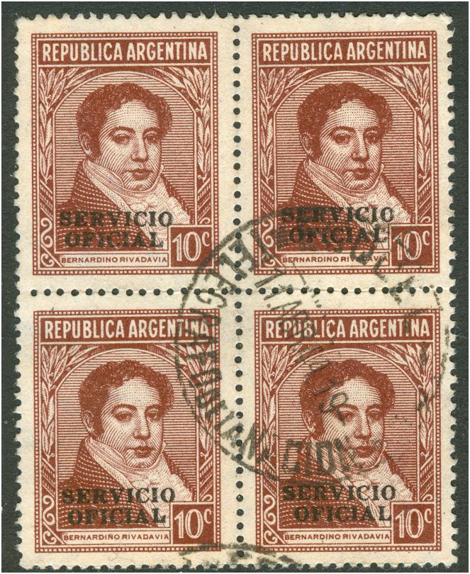
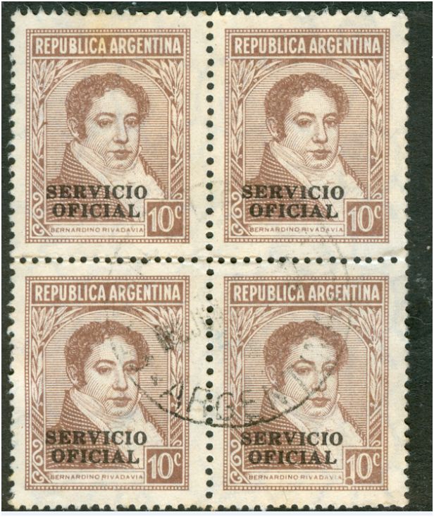
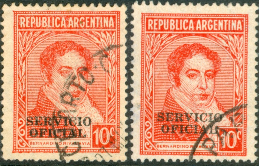
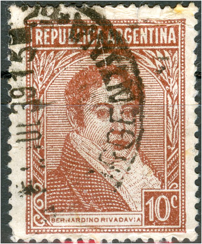
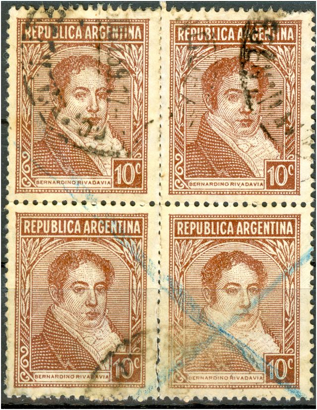
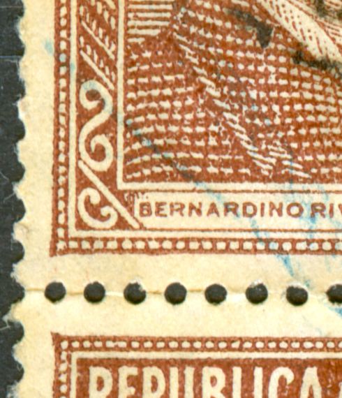
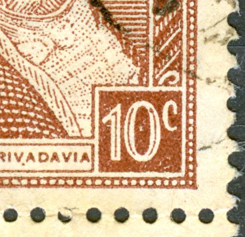
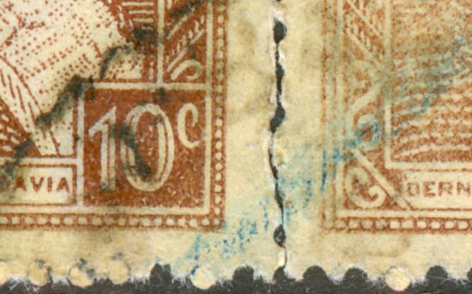
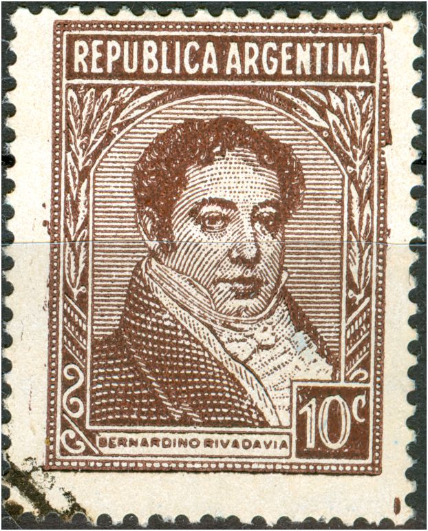
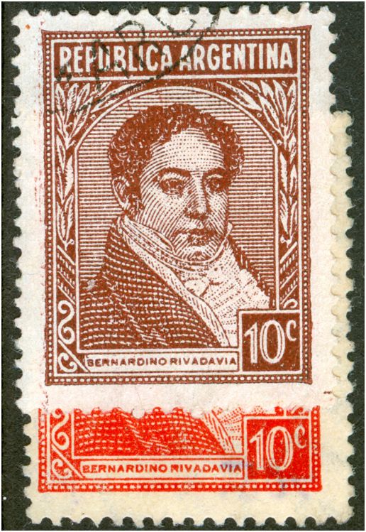
The PyR I series is stil full of surprises. Not so long ago I found a new type of the 5c Moreno in typography that had not been recognized during 70 years, this time the 10c Rivadavia in offset-litho turns out to have 3 types instead of the 2 we all had thought and what got reflected in some catalogues.

La serie de Proceres I sigue estando llena de sorpresas. Hace no mucho tiempo encontre un nuevo tipo del 5c moreno en tipografia si descubrir durante 70 años. Ahora he encontrado que hay 3 tipos del 10c en offset litom en lugar de los dos que estan descriptos en todos los catálogos.

What should have warned us was - when Tony Rubiera in his survey of this 10c showed us that after the initial years with only type A, in 1950 type B showed up and more or less with the introduction of the Zarate paper in 1954 type A returned - !!! Why a come back???

Con lo que tenemos que tener cuidado es que cuando tony Rubiera nos mostro en su investigacion que despues de los años iniciales utilizando el tipo A, en 1950 se introdujo el tipo B, y aproximadamente en 1954 con la aparicion del papel Zarate se volvió al tipo A. Porque?

This discovery is too new to have studied all the paper types that go with the 3 types so a bit of patience, please!, and have a look at your own stamps to see whether type C is there too!

Este descubrimiento es demasiado nuevo para relacionar los papeles con los 3 tipo, asi que les pido un poco de paciencia por favor , y que revisen en sus stocks para reconocer los tipos C que puedan tener.

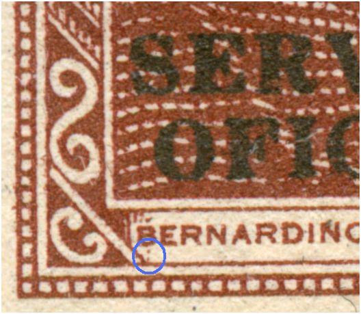
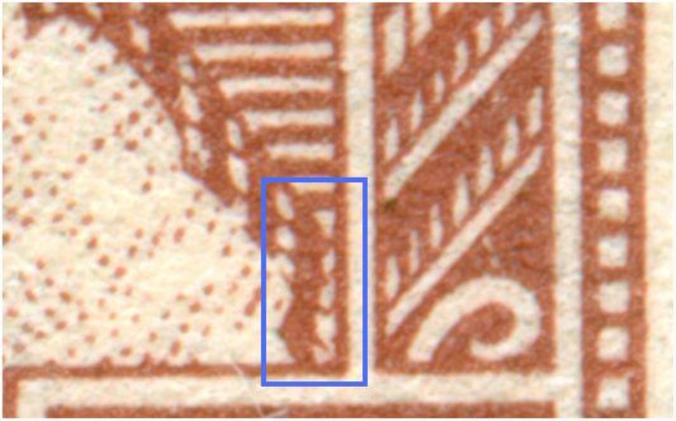
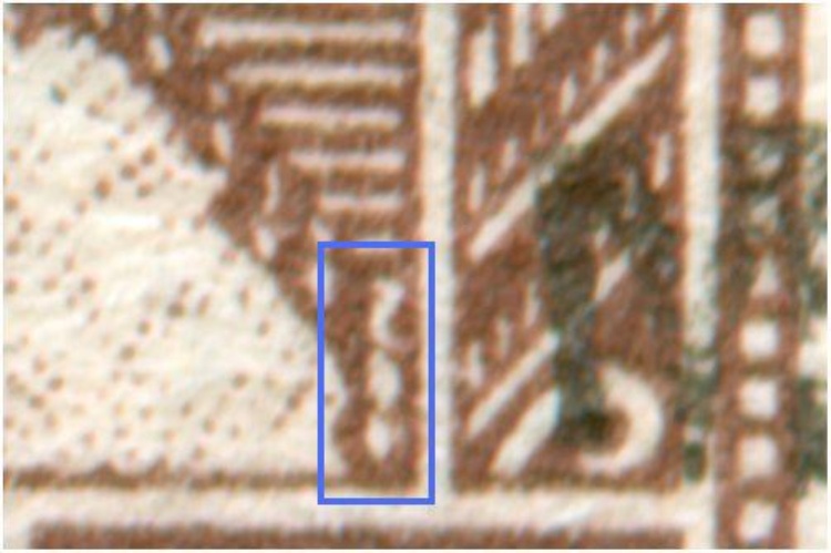
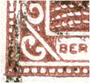
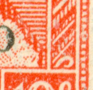
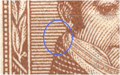
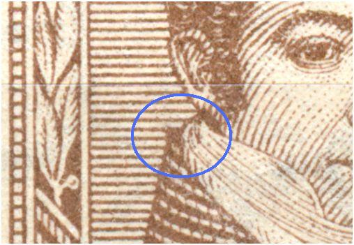
The original offset-litho with type A, with the rounded collar - in the blue rectangle, the right vertical brown outline is of the same thickness everywhere:

Para el tipo A original con cuello redondo, si se fijan en el rectangulo azul, la linea derecha vertical tiene un grosor uniforme.

Imagen

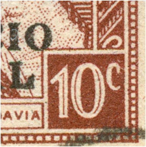
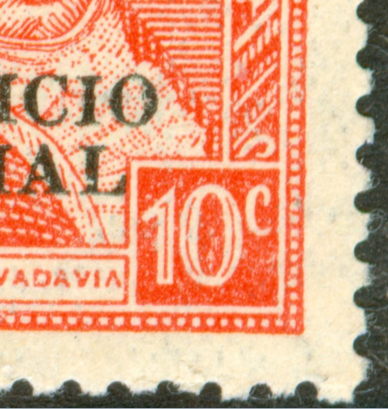
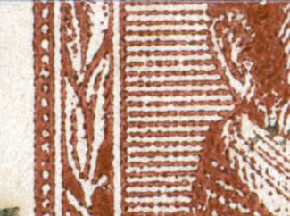
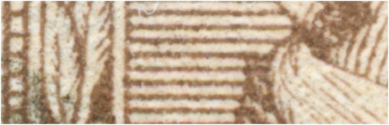
the revised type with the pointed collar - as it turns out now, this point was not the only revision, type B - in the blue rectangle the right vertical brown outline is a lot thicker and NOT indented, the top diagonal line is unbroken:
Para el tipo B, con cuello en punta, en el rectangulo azul podemos ver claramente que la linea derecha vertical es muchisimo mas gruesa y levemente sinuosa

Imagen

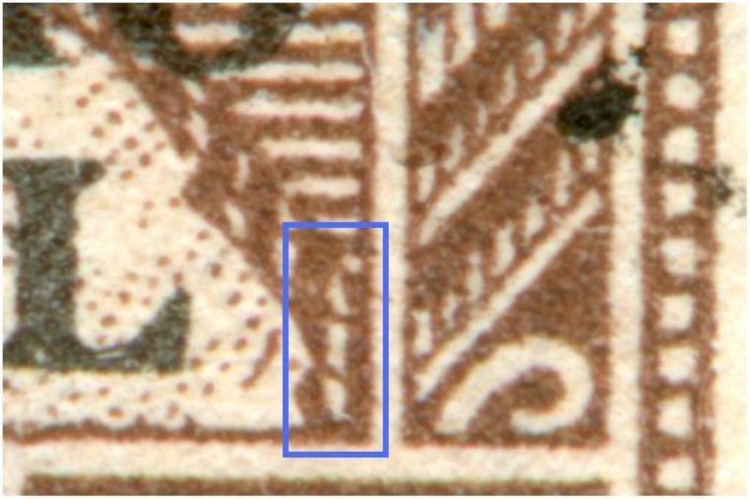
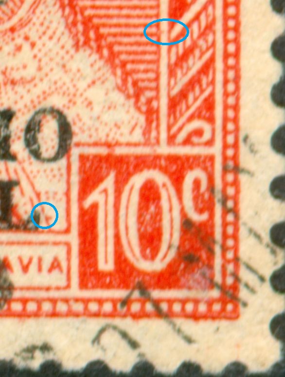
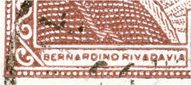
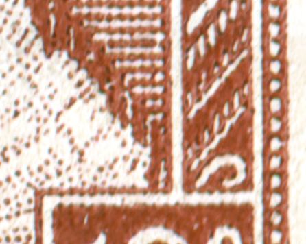
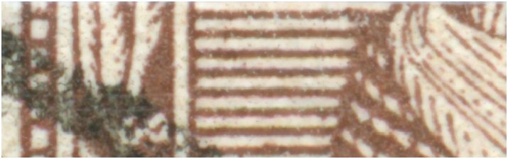
the newly discovered type C that has the collar of type A, but in the detail shown here below is quite different and resembles type B a lot - in the blue rectangle the right vertical brown outline is a lot thicker and indented, the top diagonal line is always broken!

El nuevo tipo descubierto, es una mezcla de ambas, tiene el cuello del tipo A ( Redondo) pero el detalle descripto recientemente como del tipo B.

Imagen
rubiera » 26 Nov 2009 11:38 escribió: fantastico!
to be continued ...
Avatar de Usuario
Rein
Usuario Colaborador
Usuario Colaborador
Mensajes: 6258
Registrado: 13 Mar 2009 15:59
Ubicación: Leiden, Netherlands
Contactar:

Re: The Manual - G.A. Pettigiani - 2010

Mensaje por Rein »

In offset-litho occasionally the transfer cylinder shivers, oscillates giving a peculiar result which is often described as a "double impression". in the case displayed below it is ther 10c Rivadavia in offset-litho with type B:

Imagen

Imagen

Just a side-line!

But not quite!

Note the short right leg of the second A" of Rivadavia !! This is characteristic for type B!

to be continued ...
Avatar de Usuario
Rein
Usuario Colaborador
Usuario Colaborador
Mensajes: 6258
Registrado: 13 Mar 2009 15:59
Ubicación: Leiden, Netherlands
Contactar:

Re: The Manual - G.A. Pettigiani - 2010

Mensaje por Rein »

We can have still a better look at the stamps we are not sure of their type! For instance when the collar is covered by a cancellation!

Type A:

Imagen
Imagen
Imagen

Type B:

Imagen
Imagen
Imagen

The type B stamp has a nice "español" under the "1!"

Also have a good look at the short leg of the "A" in type B!

to be continued ...
Responder

Volver a “Patriots and Resources I”