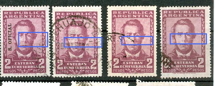
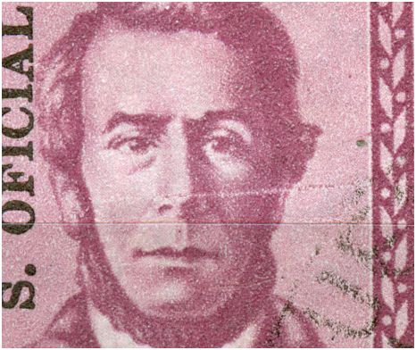
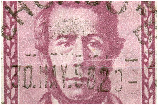
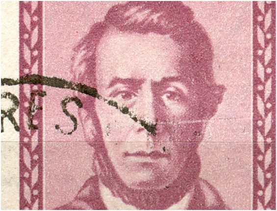
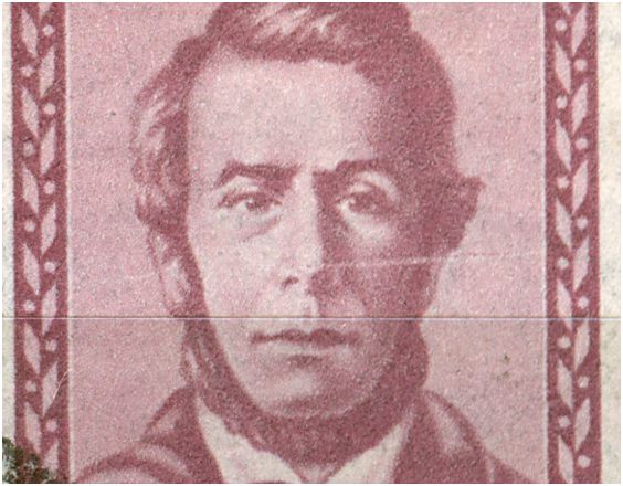
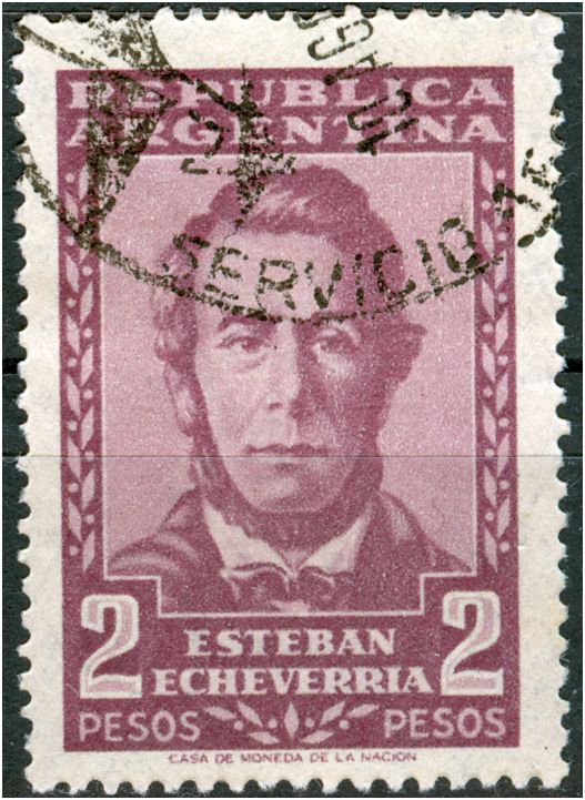
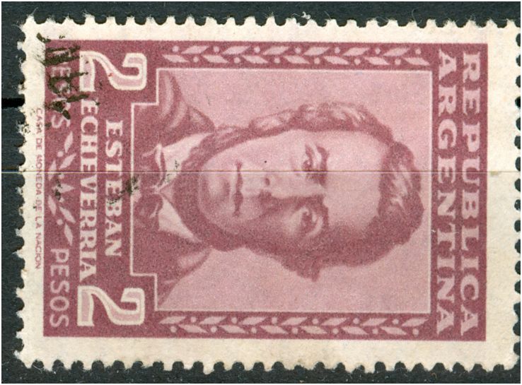
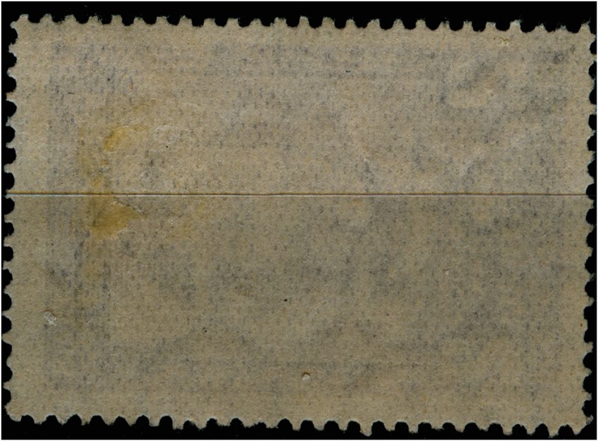
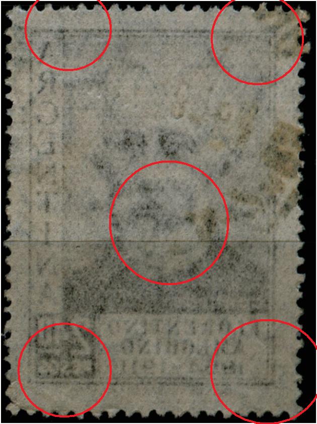
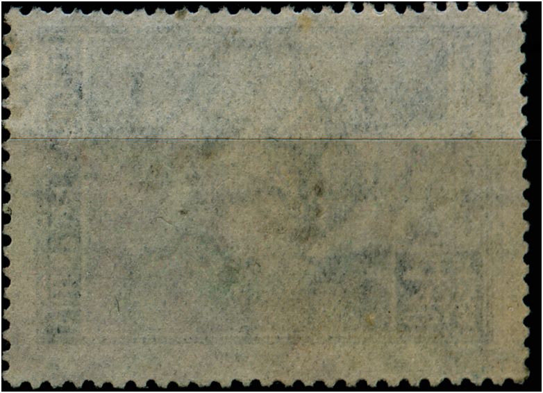
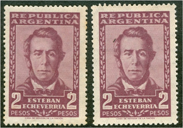
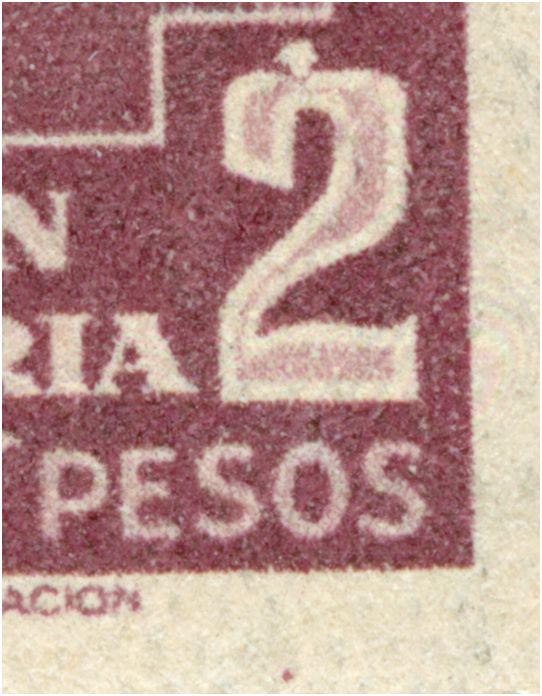
Próceres y Riquezas volume II

Topics about Argentina Philately in english language.

Moderador: Rein

Avatar de Usuario
Rein
Usuario Colaborador
Usuario Colaborador
Mensajes: 6258
Registrado: 13 Mar 2009 15:59
Ubicación: Leiden, Netherlands
Contactar:

Re: Próceres y Riquezas volume II

Mensaje por Rein »

jorgec escribió:
Rein escribió:The terms "blando"and "duro" do not tell us a thing if you do not say anything about the type of watermark involved. It is like saying the paper is "thick" or "thin". Useless descriptions unless complemented.... You can NOT disregard the watermark!
I didn't say that the watermark should be disregarded. I said that, even disregarding the watermark, the papers are still completely different.

I agree that "blando" and "duro" might be not the better names. But once again, it would be a semantic issue. When I am saying that this stamp exists on both "duro" and "blando", most people involved in the topic know what I am talking about. They know that I didn't mean these words literally, but to actually two types of paper denominated with these terms. They are used as names, and not as adjectives. This is quite common in philately.
Jorge,

it is not a semantic issue, you can use a name within a family when it is a obvious that you are Jorge and I am Rein, but in a larger group with many Jorges in it just the name is of no use... Within the group of various types of paper used for Argentinean stamps, there are several that are matt, several that are coated, a few that are blando or a few that are thick. Using the name "coated" or "blando" will not be helpful to point out to a particular type of paper. Semantics have nothing to do here....
Avatar de Usuario
Rein
Usuario Colaborador
Usuario Colaborador
Mensajes: 6258
Registrado: 13 Mar 2009 15:59
Ubicación: Leiden, Netherlands
Contactar:

Re: Próceres y Riquezas volume II

Mensaje por Rein »

jorgec escribió:
why don't you get into the merits of these postings of mine? At least I seem to agree with you that there is NO tizado!?
Rein,

I'm glad you agree with me. And of course that there is merit in your posting. I would say that there is merit in all of your postings. The problem with your postings is not really what you say, but how you say it.

Come on Rein, that thread about the "isolation" of the officials was really needed? And if you happen to believe it would be better to not have a separate sub-forum (which is a perfectly valid opinion), was there any need to be so ironic and sarcastic? Don't you think there was, at least, some merit in the admins opening that sub-forum?

What I am trying to say, honestly and as friendly as possibly, is that once you would find merits in other's people postings, then probably they would also find the merit in yours.
Jorge,

the forming of the separate English subforo has no merits other than to isolate me and preventing me to react to other people's postings at all. This is absurd and stupid in the long run. I can only see it as a punishment for being ironic at times and poking at the Argentinean philatelic tradition as cultivated here all of the time...

99% of my postings is well-meant to help the study of Argentinean stamps with a strong emphasis on the print technical aspects. What is wrong with that???? Tony Rubiera is doing it all the time and so is José Merlo. My reactions to other postings are pre-dominantly meritorious! And if they happened to be less meritorious at times? What the heck! I can see myriads of postings here that are not meritorious at all but at least they are written in your native language with all its subtle or rude nuances so it is acceptible for most of you. :)

Jorge, I appreciate your giving me friendly advice, but do not give me any crap about saying things as friendly as possible. As if you really wanted to say it rather rudely.

It is the outsider aspect! As one forero said "I have been following your posts both here and on stampboards. I believe you are shaking the AR philately. Not sure if many of things you have come up really want to be seen.."
jorgec
Usuario Colaborador
Usuario Colaborador
Mensajes: 418
Registrado: 13 Ene 2010 13:41

Re: Próceres y Riquezas volume II

Mensaje por jorgec »

Rein escribió:the forming of the separate English subforo has no merits other ...
I wasn't talking about that sub-forum, please read again what I said.
Jorge, I appreciate your giving me friendly advice, but do not give me any crap about saying things as friendly as possible. As if you really wanted to say it rather rudely.
Oh, well. I was aware, and actually warned to myself, that you would probably take it wrong. I should try to learn, and stop commenting here ...
Avatar de Usuario
Rein
Usuario Colaborador
Usuario Colaborador
Mensajes: 6258
Registrado: 13 Mar 2009 15:59
Ubicación: Leiden, Netherlands
Contactar:

Re: Próceres y Riquezas volume II

Mensaje por Rein »

jorgec escribió:
Rein escribió:the forming of the separate English subforo has no merits other ...
I wasn't talking about that sub-forum, please read again what I said.
Jorge, I appreciate your giving me friendly advice, but do not give me any crap about saying things as friendly as possible. As if you really wanted to say it rather rudely.
Oh, well. I was aware, and actually warned to myself, that you would probably take it wrong. I should try to learn, and stop commenting here ...
Jorge,

The thread I wrote wasn't really about the Oficials - you read it like that because of your involvement with the Oficials sub-foro. I read your response from my own position and hence my reaction.

I did NOT take your comment wrong and I DO appreciate your writing. Philately is as you mentioned not maths but it is also about emotions. Yours and mine. The main part of my activity in this Foro is about coming up with the results of my studies and placing links to them from the postings of others. Emotional, philosophical and cultural aspects were bound to get reflected in the way I write here and obviously it gets some people on their nerves. I don't intend to get on somebody's nerves and I really do not want to insult anybody, but if they take it like that it is their problem.

I reacted to your 100 pesos posting in the only way I can thanks to the irresponsible way the admin + moderators treated me. There is no need to defend them nor to tell me what my responsibility was in that context. They can take care of themselves.

It suffices if you can profit from my meritorious reaction to your posting. If it is of no help, OK. If it is, please continue...
Avatar de Usuario
Rein
Usuario Colaborador
Usuario Colaborador
Mensajes: 6258
Registrado: 13 Mar 2009 15:59
Ubicación: Leiden, Netherlands
Contactar:

Re: Próceres y Riquezas volume II

Mensaje por Rein »

Jorge,

this IS about semantics! :)
jorgec » 21 Apr 2010 20:41 escribió:
coco1104 escribió: Hola Jorge.

Puede ser que sea como vos digas, que este mal catalogado como tizado, cuando en realidad el papel es mate.
Yo seria aqui, un poco mas cuidadoso con la terminologia. Mas que estar mal catalogado, yo diria que simplemente el 402a no existe (y tambien que del 402 hay dos sub-papeles distintos). Hago esta sutil diferencia, porque si a esto lo llamamos como un error de catalogacion, los comerciantes van a empezar a querer cobrar al mate blando con el exhuberante precio de catalogo del 402a (lo cual seria absurdo, aunque en realidad es mas o menos lo que se suele hacer).
Stamp dealers do not give a damn about the correct description of a certain item! To them the name is not important, it is the number and the price. We still have 2 100 pesos with an ascending S. Oficial. Number can be the same and the price as well.

Collectors are like stamp dealers. Number 402a is on their manco list so it must be bought. All dealers apply the same price indication so if you need it buy it. Fellow collectors that may have a spare copy and need some cash go along the same line...

The catalogue is our definite guide and bible...

Just say the catalogue is wrong and the makers made a mistake - a mistake they will repair in the next edition :)


rc2150
jorgec
Usuario Colaborador
Usuario Colaborador
Mensajes: 418
Registrado: 13 Ene 2010 13:41

Re: Próceres y Riquezas volume II

Mensaje por jorgec »

Rein escribió:this IS about semantics! :)
jorgec » 21 Apr 2010 20:41 escribió:Yo seria aqui, un poco mas cuidadoso con la terminologia.
Of course it is semantics.

There is nothing wrong in talking and debating semantics; as long as we are all aware we deal with semantics, and as long as the semantics debate doesn't ofuscate the main issue.
Stamp dealers do not give a damn about the correct description of a certain item! To them the name is not important, it is the number and the price. We still have 2 100 pesos with an ascending S. Oficial. Number can be the same and the price as well.
Usually it is like that, I agree.

However, I wouldn't be fair if I wouldn't mention here, that one dealer is currently selling (at ML) the 3 types of the 100p Esquiador, correctly identified, and at a more or less fair price. I don't like the exact way he is describing the blando/baboso/thin type (as not showing in any catalog, which might be technically correct, but it sounds a bit as too marketing), but I am nitpicking.
Avatar de Usuario
Rein
Usuario Colaborador
Usuario Colaborador
Mensajes: 6258
Registrado: 13 Mar 2009 15:59
Ubicación: Leiden, Netherlands
Contactar:

Re: Próceres y Riquezas volume II

Mensaje por Rein »

Jorge,

the "blando" is a really interesting type of paper I dealt with in another thread some months ago. When I had to classify the stamps I had I already had placed them under Zárate with symmetrical paper mesh. The suns are a bit smaller that the imported paper we had before with an orthogonal watermark. I would not be surprised that more people had done as I did. Dario Bardi stressing the point of a smaller Sun for the Zárate paper had only encouraged me to do so, but now with the way of breaking the gum as a characteristic for the imported papers I am fully convinced we have an imported paper here with an orthogonal watermark combined with a symmetrical paper mesh.

We should measure the distances between the lines of the sun, the distances between the hearts of the sun on one line more accurately and also the diameters of the sun.

I reserved this type of paper in my Excel files with the code MI8 .....
Avatar de Usuario
Rein
Usuario Colaborador
Usuario Colaborador
Mensajes: 6258
Registrado: 13 Mar 2009 15:59
Ubicación: Leiden, Netherlands
Contactar:

Re: Próceres y Riquezas volume II

Mensaje por Rein »

The 3 face values 2p Echeverria, 2p40 Ameghino and 4p40 Sainz Peña have been printed in photogravure only by the Casa de Moneda de la Nacion on the Mailander press.

As to the papers there is only the variety within the symmetrical paper mesh plus orthogonal watermark [Zárate paper "granulado"] as to whether the rhomboid indents have a preference to appear at the front or at the back or at both sides of the stamp!

In all 3 stamps we have the scarce variant of a horizontal direction of paper [eje de enrolllamiento] resulting in the line of AЯ running parallel to the long side of the stamp!!!!!

Plate flaws should be present but so far I have come up with the "scratch from under his nose":


Imagen

Imagen

Imagen

Imagen

Imagen
Avatar de Usuario
Rein
Usuario Colaborador
Usuario Colaborador
Mensajes: 6258
Registrado: 13 Mar 2009 15:59
Ubicación: Leiden, Netherlands
Contactar:

Re: Próceres y Riquezas volume II

Mensaje por Rein »

The 2p Echeverria with 2 different watermark orientations.

Orthogonal watermark, symmetrical paper mesh, direction of paper vertical:

Imagen

Imagen

Orthogonal watermark, symmetrical paper mesh, direction of paper horizontal:

Imagen
Imagen

All having the so-called "filigrana traspuesta" or rather "transposed paper" as the watermark AЯ is on the back of the stamp and hehnce on the felt side of the paper. The dandy-roll has "RA"!!!

rc2328
Avatar de Usuario
Rein
Usuario Colaborador
Usuario Colaborador
Mensajes: 6258
Registrado: 13 Mar 2009 15:59
Ubicación: Leiden, Netherlands
Contactar:

Re: Próceres y Riquezas volume II

Mensaje por Rein »

The 2p40 Ameghino with 2 different watermark orientations.

Orthogonal watermark, symmetrical paper mesh, direction of paper vertical:

Imagen
Imagen

Orthogonal watermark, symmetrical paper mesh, direction of paper horizontal:

Imagen
Imagen

All having the so-called "transposed paper"!
Avatar de Usuario
Rein
Usuario Colaborador
Usuario Colaborador
Mensajes: 6258
Registrado: 13 Mar 2009 15:59
Ubicación: Leiden, Netherlands
Contactar:

Re: Próceres y Riquezas volume II

Mensaje por Rein »

The 4p40 Saenz Peña with 2 different watermark orientations.

Orthogonal watermark, symmetrical paper mesh, direction of paper vertical:

Imagen
Imagen

Orthogonal watermark, symmetrical paper mesh, direction of paper horizontal:

Imagen
Imagen

All having the so-called "transposed paper"!

rc2330
Avatar de Usuario
Rein
Usuario Colaborador
Usuario Colaborador
Mensajes: 6258
Registrado: 13 Mar 2009 15:59
Ubicación: Leiden, Netherlands
Contactar:

Re: Próceres y Riquezas volume II

Mensaje por Rein »

For the 1955 PyR II definitives a new perforation size was introduced that is for the recess-printed 50c and 3P; for the 2 stamps in photogravure the old perforations were still in use - 80c, 2p Eva Perón Foundation - a size that was still in use for the PyR I offset-litho printed stamps. All later, post 1955, issued stamps had the new, somewhat wider size. But with the exception of the 2p Echeverria!

Imagen
Avatar de Usuario
Rein
Usuario Colaborador
Usuario Colaborador
Mensajes: 6258
Registrado: 13 Mar 2009 15:59
Ubicación: Leiden, Netherlands
Contactar:

Re: Próceres y Riquezas volume II

Mensaje por Rein »

It more often occurs that a stamp get smaller when the perforation stroke was too short. In the case of the 2p Echeverria the comb was moving horizontally. Usually you see a slightly thicker tooth and the lefthand or righthand side:

Imagen

But a narrower stamp should be met more often

Imagen
Avatar de Usuario
Rein
Usuario Colaborador
Usuario Colaborador
Mensajes: 6258
Registrado: 13 Mar 2009 15:59
Ubicación: Leiden, Netherlands
Contactar:

Re: Próceres y Riquezas volume II

Mensaje por Rein »

Another cylinder characteristic [or rather 2 counting the dot in the bottom margin!]:

Imagen

Imagen

rc2333
Avatar de Usuario
Rein
Usuario Colaborador
Usuario Colaborador
Mensajes: 6258
Registrado: 13 Mar 2009 15:59
Ubicación: Leiden, Netherlands
Contactar:

Re: Próceres y Riquezas volume II

Mensaje por Rein »

Only in 1963 a nationally manufactured coated paper got introduced - Tizado nacional - and this type of paper - with the Multiple Suns + AЯ watermark - had been used for several defintiives in the 1963-1969 period.

But already by late 1965 a special version of this coated paper emerged: the Tizado Varioloso or Pockmarked coating.

Probably used mainly for sheet-fed printing in offset-litho, photogravure and typography [?] and hence available in the Casa de Moneda in piles of loose sheets. Had the paper been gummed before cutting reels into sheets?

This question arises with the found of a 25p Quebracho stamp apparently without coating - in photogravure on the Mailander sheet-fed press - but when you turn the stamp over you will see the TV!
Responder

Volver a “Argentina Philately in the language of Shakespeare”