Dot right of the "A" below both in row 9 and in row 10!
to be continued ...
Moderador: Rein


The complicated issue of the 10c red in reel-fed typography has almost reached it apogeum! Guillermo has found the solution for all the different plates in the use of 4 blocks of 5x1 to make up a whole printing sheet!CastañoOcre » 30 Dec 2011 15:28 escribió:
Estimados...
Llevó tiempo pero al fin terminé la primera parte del estudio de esta emisión en impresiones rotativas.
Hay mucho camino por andar. Pero este puntapié nos va a permitir entender más y mejor la emisión de 10c marrón también.
Espero que disfruten su lectura como yo disfruté haciendo este trabajito.... !!!
Lamentablemente las condiciones del foro no me permiten subir imágenes con mejor resolución .
¡¡Feliz año para todos !!
Guillermo
to be continued ...CastañoOcre » 30 Dec 2011 15:29 escribió:
Hoja nro. 2
Para mayor resolución Ver: http://filateliadigital.blogspot.com/20 ... esion.html
CastañoOcre» 30 Dec 2011 15:30 escribió:
Hoja nro. 3
Para mayor resolución Ver: http://filateliadigital.blogspot.com/20 ... esion.html
CastañoOcre» 30 Dec 2011 15:30 escribió:
Hoja nro. 4
Para mayor resolución Ver: http://filateliadigital.blogspot.com/20 ... esion.html
CastañoOcre» 30 Dec 2011 15:31 escribió:
El artículo completo y el resto de las hojas, nro 5 a nro 12 se pueden ver aquí con mejor resolución:
http://filateliadigital.blogspot.com/20 ... esion.html
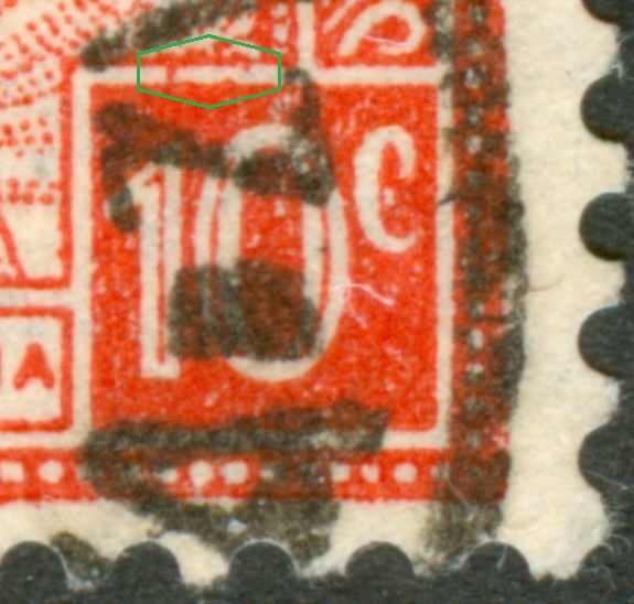
educ escribió:http://foro.filateliaargentina.org/down ... cvRojo.zip
ahora si creo que esta bien.
Eduardo
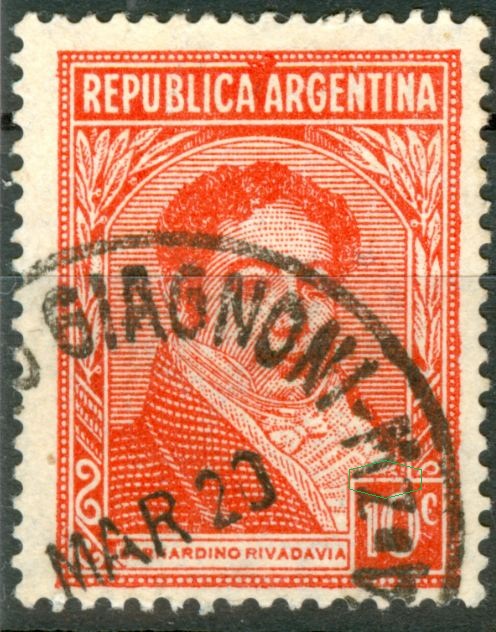
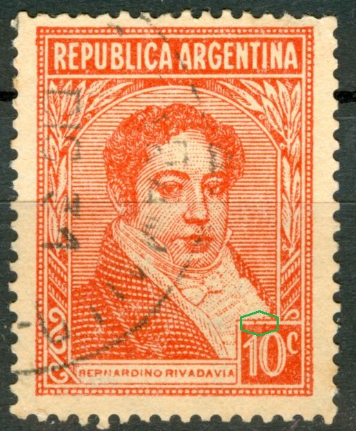
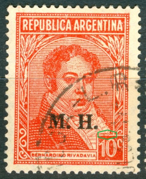
The Rivadavia that vanished into thin air
Post by Rein » 04 Apr 2010 12:22
The 10c Rivadavia has been terribly neglected in the Argentinean catalogues. Not only the offset-litho version but also the typography version. The base stamps are so common that nobody had really bothered too much ....
Let us start with the 10c in typography!
The red coloured version is supposed to have 3 versions if we are to believe the catalogues - and by now you should know that I do not believe things that easily!
Relying a lot on the article made by Leopoldo Tenorio Casal (Nr 40 Revista del Centro Filatélico de la Plata - 1947) we should make a distinction between the sheet-fed and the reel-fed versions!
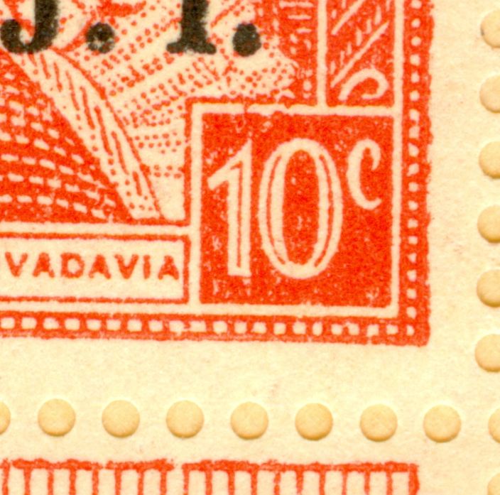
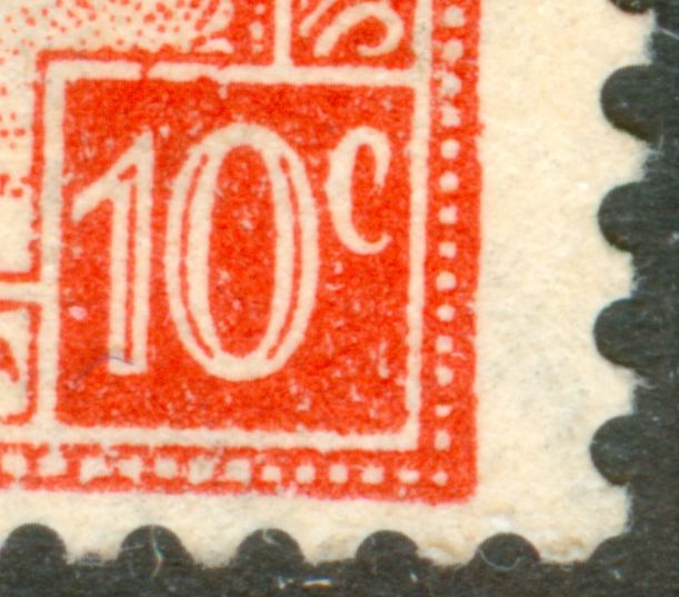
10c red:
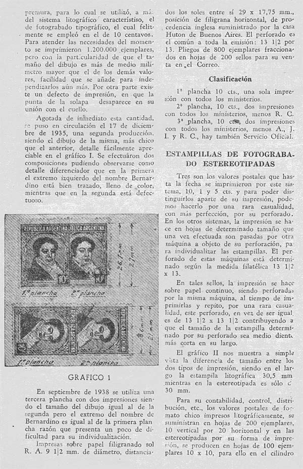
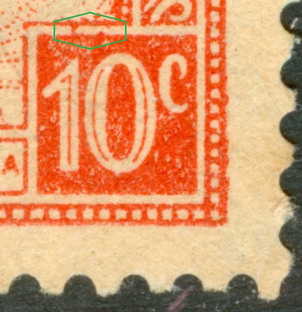
01.10.1935 sheet-fed, 1st plate [only 1 printing]; the stamp measuring 24.0x30.5mm, the design 21.0x27.0mm. Known as tipo I with comb perforation 13.333:13.147 [13 1/2:13 in M.T.].
17.12.1935 sheet-fed, 2nd plate [2 printings]; the stamp measuring 24.0x30.5mm, the design 20.6x26.7mm. Known as tipo II with comb perforation 13.333:13.147 [13 1/2:13 in M.T.]
01.06.1936 reel-fed, 11 printings; the stamp measuring 24.0x30.0mm, the design 20.0x26.5mm. Known as tipo II with comb perforation 13.333:13.333 [13 1/2 in M.T.]
x.09.1938 sheet-fed, 3rd plate [2 printings]; no further details but for the fact that according to Tenorio Casal the word "Bernardino" is back to the length of the 1st plate....
The latter fact should mean that we have at least 4 different 10c red! At least, as we do NOT know how different are the subsequent printings and we know already that for the 5c Moreno the 19.03.1937 reel-fed printings (13 in total) had 2 major design types!!!
Although the catalogues mention the differences in perforation, none does mention the differences in sizes [both design and stamp height! ]
to be continued .....