Página 1 de 2
Recess, typography, photogravure and offset-litho
Publicado: 15 Jul 2009 05:32
por Rein
The 4 main printing methods for postage stamps: recess, typography, photogravure and offset-litho are hardly known to the general collector nowadays. As the recently issued catalogues do not bother often to mention in what printing method a certain stamp has been printed the general collector will hardly ever meet these notions....
Occasionally howver, stamps appear to have been printed in both methods and very rarely the catalogues mention the differences.
It seems to me that it is high time to publish the stamps that have been printed in more than one method and show the differences!
As to the 1961 20p Jose de San Martin I had already shown how to recognize the offset-litho from the typography stamps:
http://www.filateliaargentina.com.ar/fo ... =49&t=1415
Re: Recess, typography, photogravure and offset-litho
Publicado: 15 Jul 2009 11:45
por Rein
The 5c José de San Martin stamps exist in both offset-litho and in typography. And as to the offset-litho according to Samuel Klass there are even subdivisions of this offset-litho a.o. the hueco-offset!
No catalogue-maker indicates that there is a basic difference in design!
http://www.filateliaargentina.com.ar/fo ... 918#p10918
Re: Recess, typography, photogravure and offset-litho
Publicado: 15 Jul 2009 12:49
por zakur
Kneitschel 61 explains the differences in the design for each type, mainly three or four leaves in the bottom of the design.
Re: Recess, typography, photogravure and offset-litho
Publicado: 15 Jul 2009 14:04
por Rein
zakur escribió:Kneitschel 61 explains the differences in the design for each type, mainly three or four leaves in the bottom of the design.
Pablo,
I am glad at least one catalogue gives is that information! And another good reason for me trying to et the Kneitschel catalogues well!
But in the meantime we are almost 50 years later and new generations of collectors have no sources to get such precious information! Is the new G.J. going to get us informed????
As to the leaves, you can see in my post with the pictures that I have come to that as well by myself...
In the Netherlands we have this saying "why trying to re-invent the wheel???"
But apparently philately has got the intrinsic urge to forget what previous generations had built up....
Re: Recess, typography, photogravure and offset-litho
Publicado: 15 Jul 2009 15:59
por zakur
It's even worse: the newer catalogs usually classify stamps like this as Type I, Type II, Type III and Type IV following kneitschel clasification... but they don't explain the differences between types!
Re: Recess, typography, photogravure and offset-litho
Publicado: 15 Jul 2009 16:48
por Rein
zakur escribió:It's even worse: the newer catalogs usually classify stamps like this as Type I, Type II, Type III and Type IV following kneitschel clasification... but they don't explain the differences between types!
Pablo,
being new to Argentina philately , I do not mind inventing the wheel again and publish my findings

Re: Recess, typography, photogravure and offset-litho
Publicado: 17 Jul 2009 09:25
por Rein
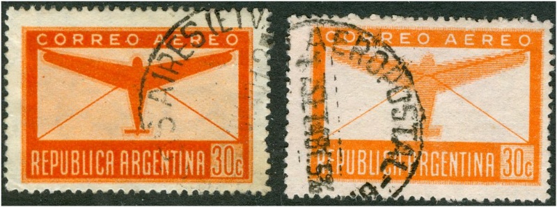
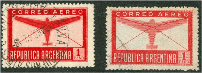
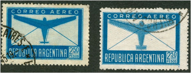
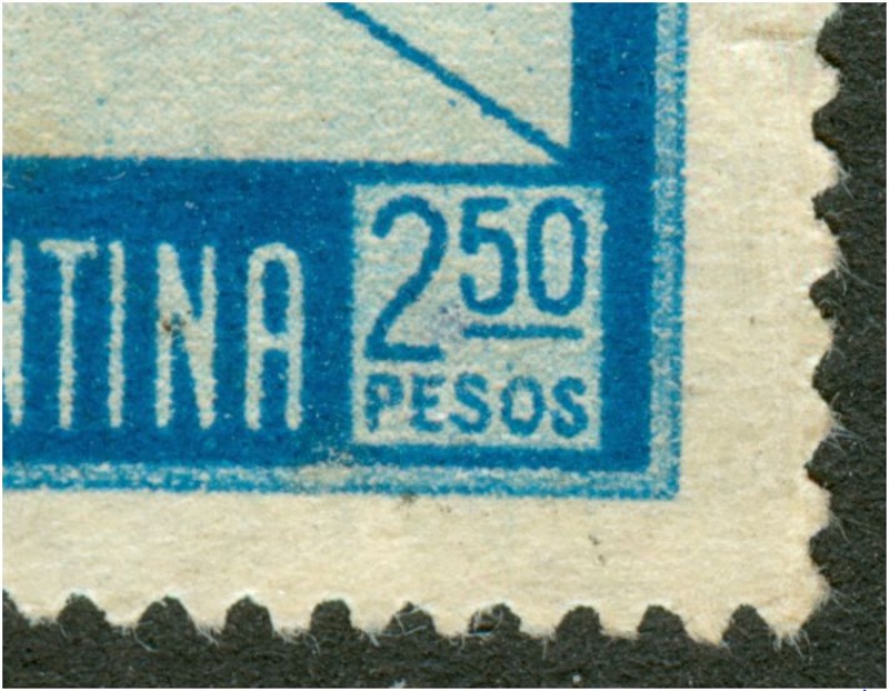
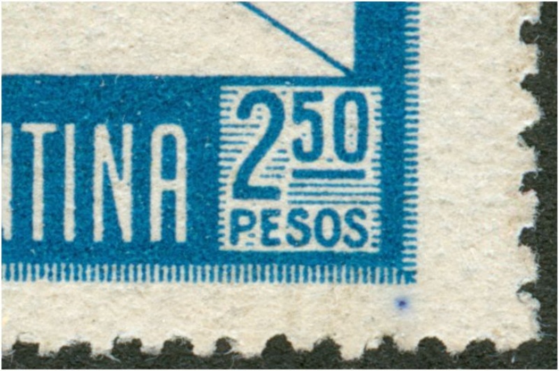
The 1940 Correos Aero stamps wre first issued in photogravure, but a few years later in offset-litho. The design had been changed quite a lot - mainly by the use of separate horizontal lines where before the planin background showed the photogravure screen:
Both of them:
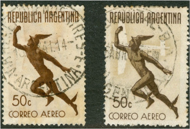
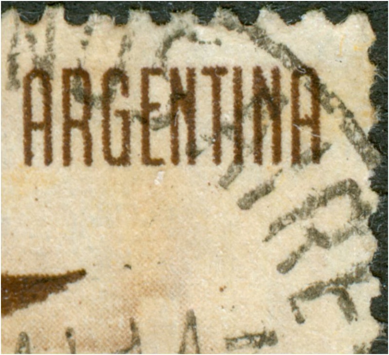
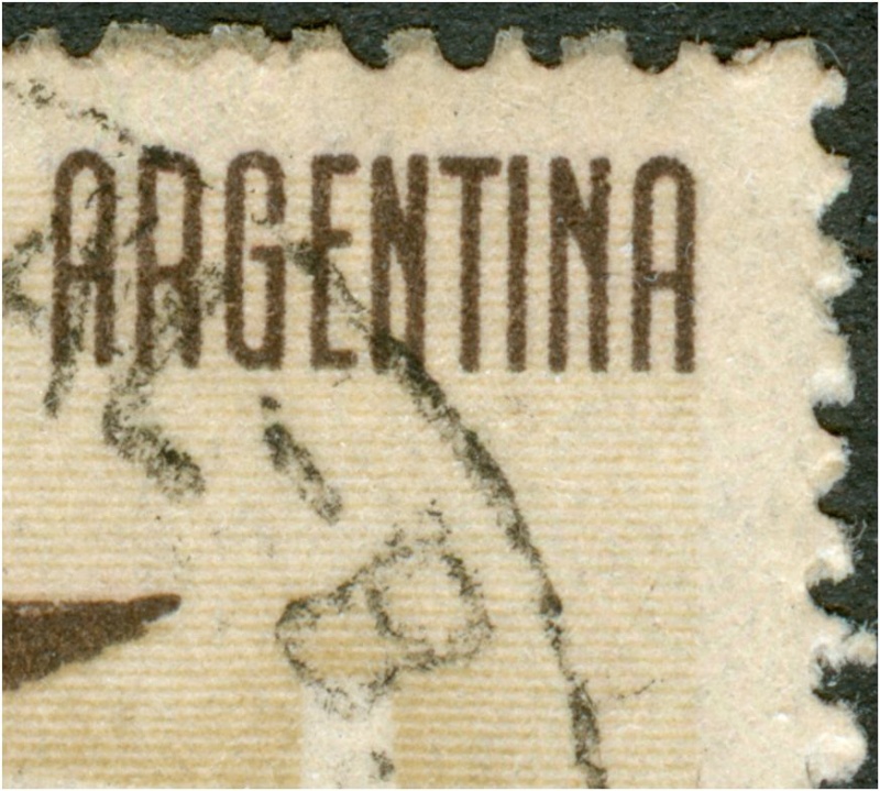
Look at the details of the body in the offset-litho printing!
The photogravure printing:
The offset-litho printing:
Re: Recess, typography, photogravure and offset-litho
Publicado: 17 Jul 2009 11:11
por zakur
This is my topic-of-the-week issue, Rein!!!
After overlooking it for over 20 years, I only realized that there were two different printing methods last week!
And due to the different design you do not have to be a specialist to distinguish them!
Thanks for the detailed images, do you have scans of the "planes" from the same issue? Just an image may help others to avoid my same mistake....
Justo esta es la serie que estoy mirando estos días.
Después de 20 años de clasificarla incorrectamente descubrí que hay dos métodos de impresión y debido al diferente diseño, no es necesario ser un especialista en métodos de impresión para distinguirlas, basta con ver las imágenes de cada una.
Re: Recess, typography, photogravure and offset-litho
Publicado: 17 Jul 2009 11:13
por Rein
Pablo,
I will certainly make detailed scans of the other values as well!
I am just glad these scans are of some use to someone
Re: Recess, typography, photogravure and offset-litho
Publicado: 17 Jul 2009 11:26
por Rein
Recognizing printing methods and differences in paper are my specialization for several decennia!
It is high time to hand over the information - I do that in my monthly columns for a printed philatelic magazine, but the access to the internet and the possibility to make good scans and later on publish them on a web-site or blog has made it a lot easier to spread the information!
It would be a good idea for all catalogue manufacturers to use detailed scans like these to explain the differences in types etc.... Or even worse... I think it should be obligatory!
Re: Recess, typography, photogravure and offset-litho
Publicado: 17 Jul 2009 11:27
por Rein
The 1940 Correos Aero stamps wre first issued in photogravure, but a few years later in offset-litho. The design had been changed quite a lot - mainly by the use of separate horizontal lines where before the planin background showed the photogravure screen:
Both of them:
The photogravure printing:
The offset-litho printing:

Re: Recess, typography, photogravure and offset-litho
Publicado: 17 Jul 2009 11:29
por zakur
As you say, with all the possibilities that Internet gives us, they will do it eventually, or become obsolete....
Re: Recess, typography, photogravure and offset-litho
Publicado: 17 Jul 2009 11:46
por Rein
The 1940 Correos Aero stamps wre first issued in photogravure, but a few years later in offset-litho. The design had been changed quite a lot - mainly by the use of separate horizontal lines where before the plain background showed the photogravure screen:
Both of them:
The photogravure printing:
The offset-litho printing:
Re: Recess, typography, photogravure and offset-litho
Publicado: 17 Jul 2009 11:52
por Rein
The 1940 Correos Aero stamps wre first issued in photogravure, but a few years later in offset-litho. The design had been changed quite a lot - mainly by the use of separate horizontal lines where before the plain background showed the photogravure screen:
Both of them:
The photogravure printing:
The offset-litho printing:
Re: Recess, typography, photogravure and offset-litho
Publicado: 17 Jul 2009 12:15
por zakur
Thank you very much Rein!!!
Para completar el post, los pirmeros (photogravure - fondo lleno) son los que MT cataloga como huecograbado, números 20-24 siempre con filigrana.
Los offset-litho son los catalogados como offset, números MT 25-26A (con filigrana RA) ó 27-30 (sin filigrana)