Página 1 de 1
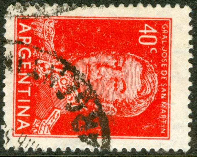
1954 20c and 40c José de San Martin
Publicado: 24 May 2011 07:22
por Rein
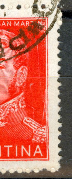
The 20c JSM in typography was printed on the reel-fed Goebel rotary using coated paper imported from Wiggins Teape in the UK [Scotland Aberdeen?]. The orthogonal watermark can ALWAYS be read as AЯ upside down as seen from the back of the stamp!
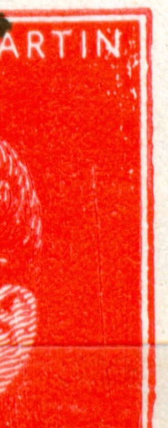
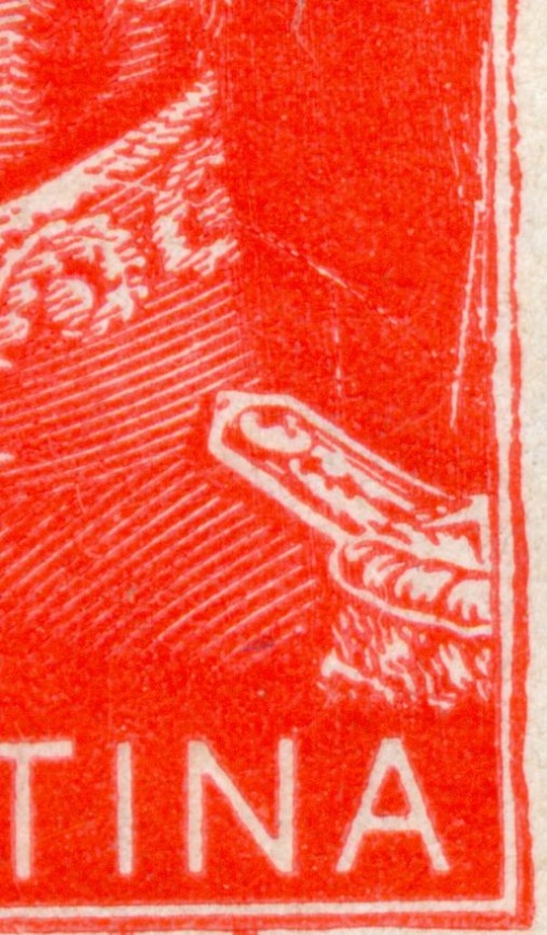
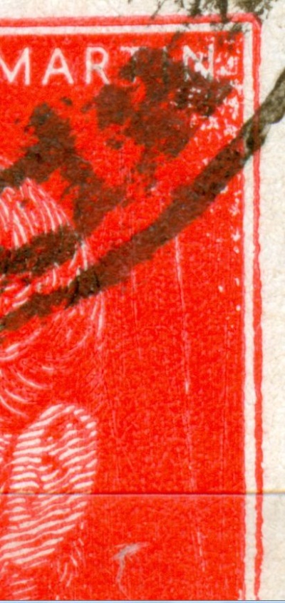
The quality of print is miserable with innumerable dots, blots, scratches etc. outside the actual design. One tends to ignore this all and attribute any "flaw" to the bad printing or plate/cylinder production.
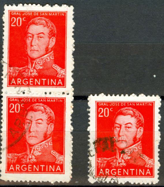
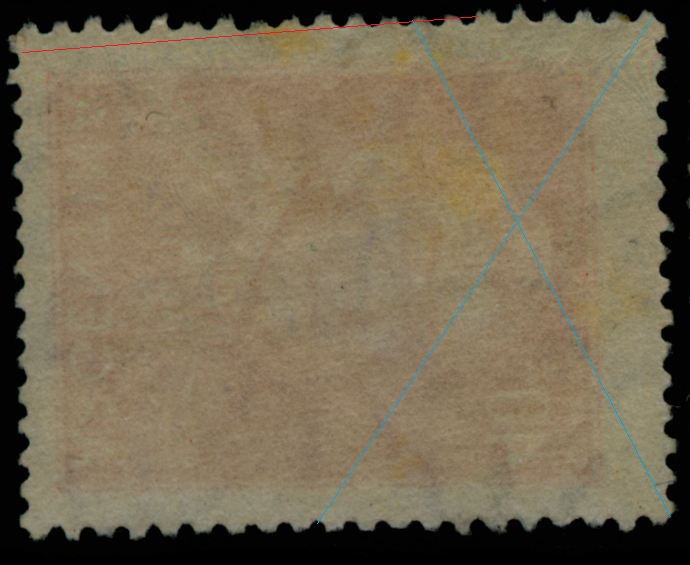
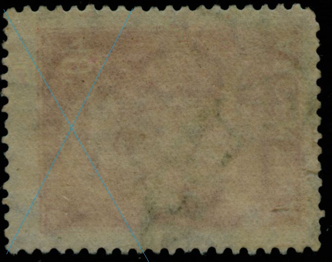
Notwithstanding this I happened to find a few stamps that have a remarkable similarity:
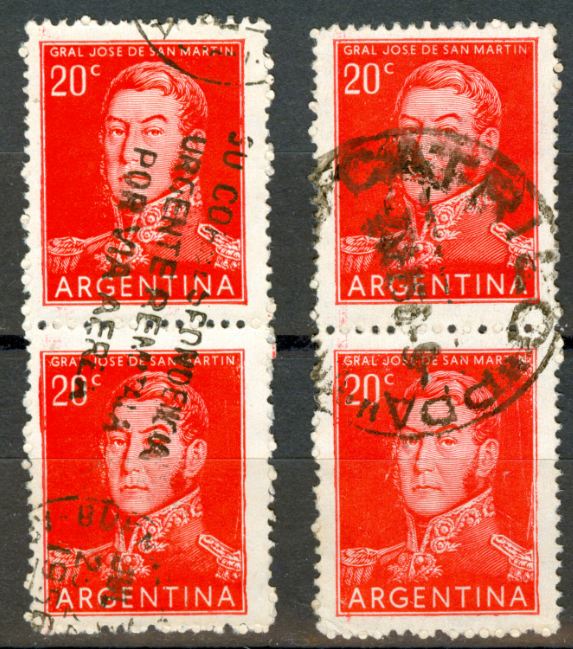
In detail:
lower left stamp:
lower right stamp:
to be continued ....
Re: 1954 20c and 40c José de San Martin
Publicado: 24 May 2011 07:23
por Rein
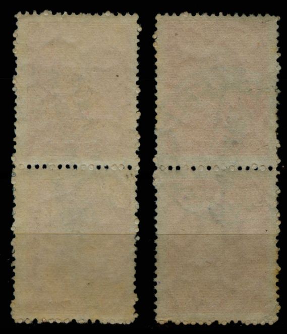
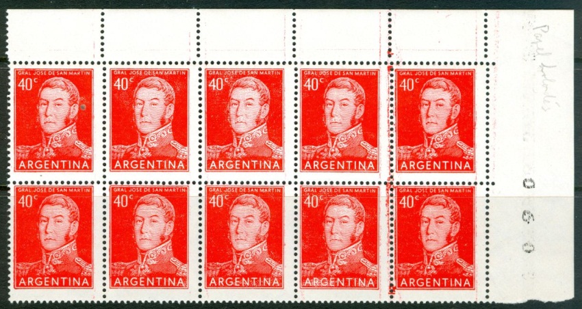
And if you look at the perforation holes you might even think that the perforation holes - or rather the unopened ones - are exactly the same - both left and right!
to be continued ...
Re: 1954 20c and 40c José de San Martin
Publicado: 24 May 2011 07:32
por Rein
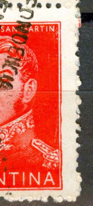
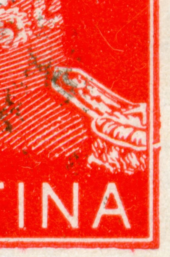
In detail:
upper left stamp:
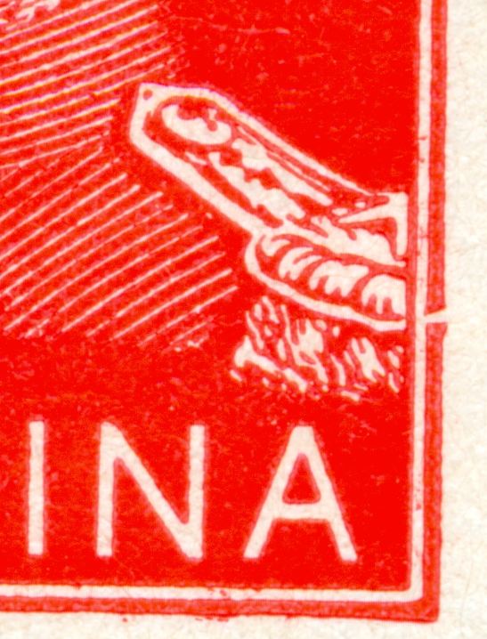
right stamp:
to be continued ....
Re: 1954 20c and 40c José de San Martin
Publicado: 24 May 2011 22:04
por Otin
Rein,
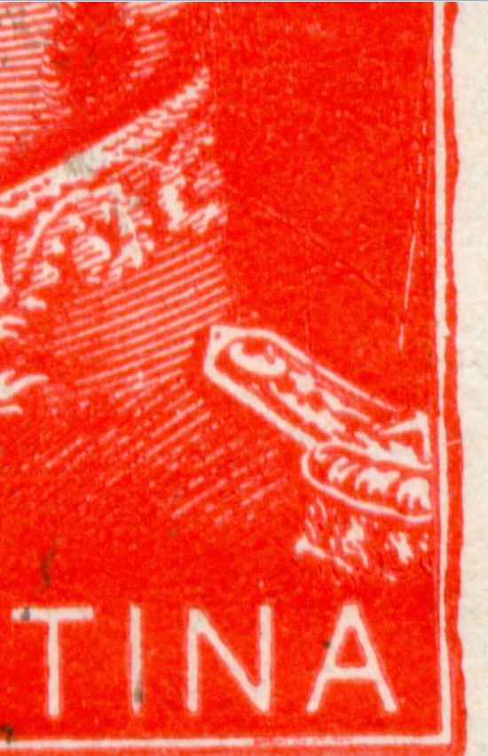
When they printed these stamps the old Goebel was really old. Re,e,ner this press had its own perforation comb. As you say, scratches are abundant and I think the typograpic alloy was too soft. It is also evident that the molds for the clichés were careless finished thus resulting melted alloy copied those imperfections. If you look for faults you would even find stamps showing outside frame lines cut intentionally perhaps to accomadate a "rebel" cliche into the printing cilinder. The shet fed press stamps do not show these "varieties".
José
Re: 1954 20c and 40c José de San Martin
Publicado: 25 May 2011 04:46
por Rein
Otin escribió:Rein,
When they printed these stamps the old Goebel was really old. Remember this press had its own perforation comb. As you say, scratches are abundant and I think the typograpic alloy was too soft. It is also evident that the molds for the clichés were careless finished thus resulting melted alloy copied those imperfections. If you look for faults you would even find stamps showing outside frame lines cut intentionally perhaps to accomadate a "rebel" cliche into the printing cilinder. The shet fed press stamps do not show these "varieties".
José
José,
I did not expect any repetition having seen so many imperfections already! That is why this fault is so remarkable!! Even the pre-1944 cliches were rather perfect! From 1944 onwards the mess started....
Re: 1954 20c and 40c José de San Martin
Publicado: 25 May 2011 11:54
por Otin
Rein,
In my next shipment I¨ll send you copies of some repetitives varieties.
José
Re: 1954 20c and 40c José de San Martin
Publicado: 16 Ago 2011 07:04
por Rein
Nice public relation for our beloved stamps:

Re: 1954 20c and 40c José de San Martin
Publicado: 22 Ago 2011 21:35
por Otin
Rein:
You are right, these stamps are rhe worst printed because, I think for the defectous casting of the clisches. As to the perforations y don´t see they are exactly de same. However it is evident that many pins of the comb were loose and that also for the stregnth of that paper they cannot perforate it completely Saludos,
José
Re: 1954 20c and 40c José de San Martin
Publicado: 01 Ene 2012 20:58
por Rein
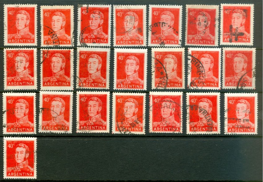
The catalogues do not give us any "plate flaws" nor systematical characteristics of these 2 stamps! However, I just happened to spot a rather remarkable characteristic that hardly could have been overlooked!
Out of some 280 40c stamps on Zárate paper - uncoated paper, orthogonal watermark, direction of paper vertical - 22 copies did have the same feature of the "4"!
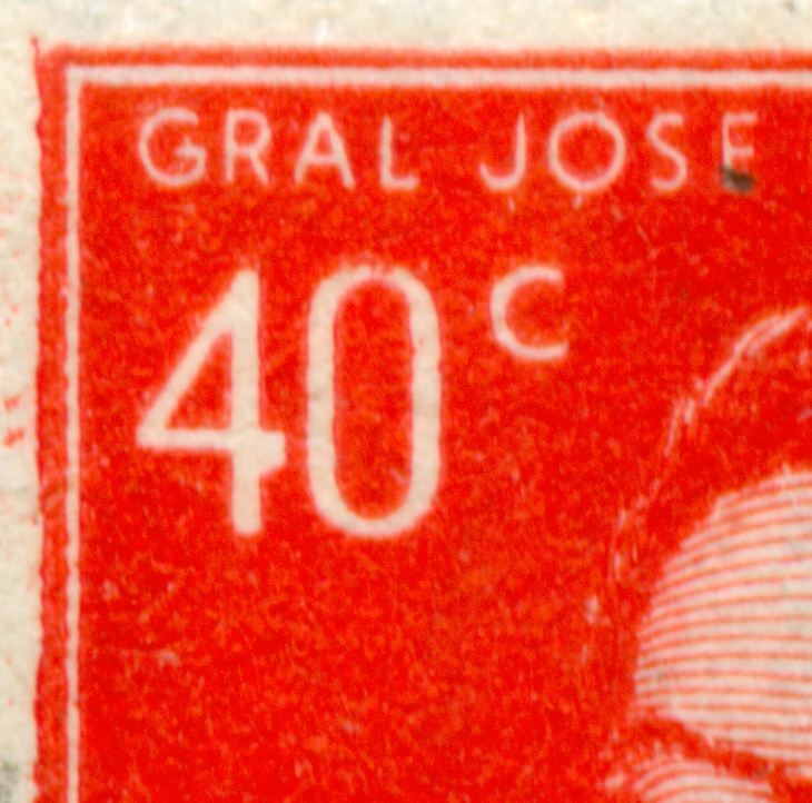
Looks like a root block of 5x2 or two different root block of 5x1....
to be continued ...
Re: 1954 20c and 40c José de San Martin
Publicado: 02 Ene 2012 07:44
por Rein
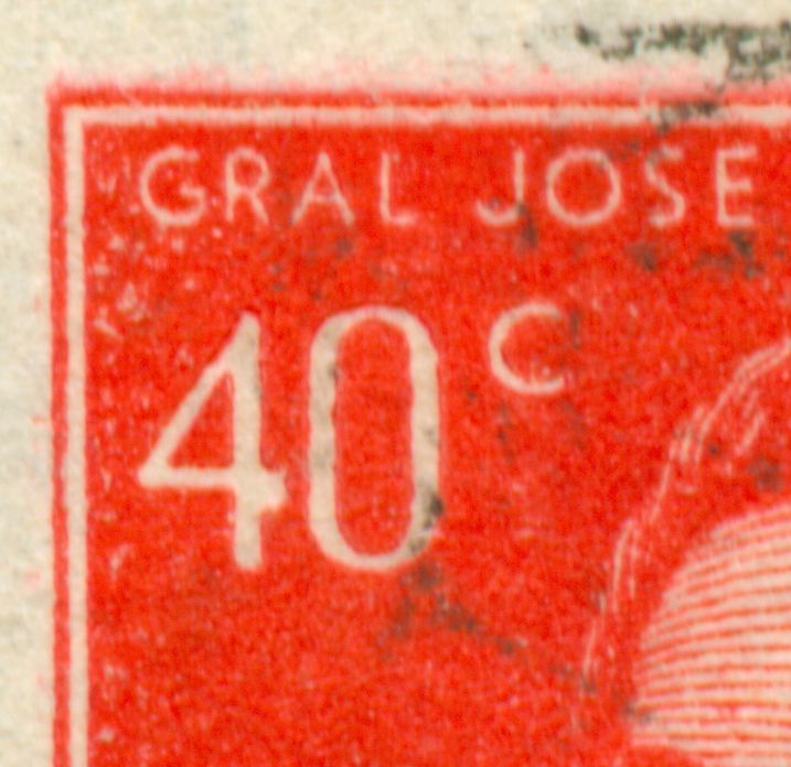
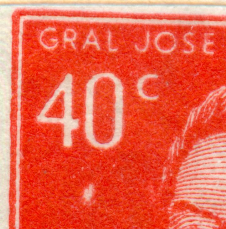
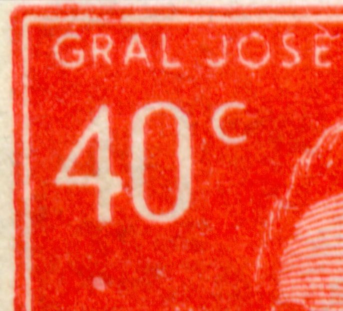
The catalogues do not give us any "plate flaws" nor systematical characteristics of these 2 stamps! However, I just happened to spot a rather remarkable characteristic that hardly could have been overlooked!
Out of some 180 40c stamps on coated Wiggins Teape paper, orthogonal watermark, direction of paper vertical - 15 copies did have the same feature of the "4"!
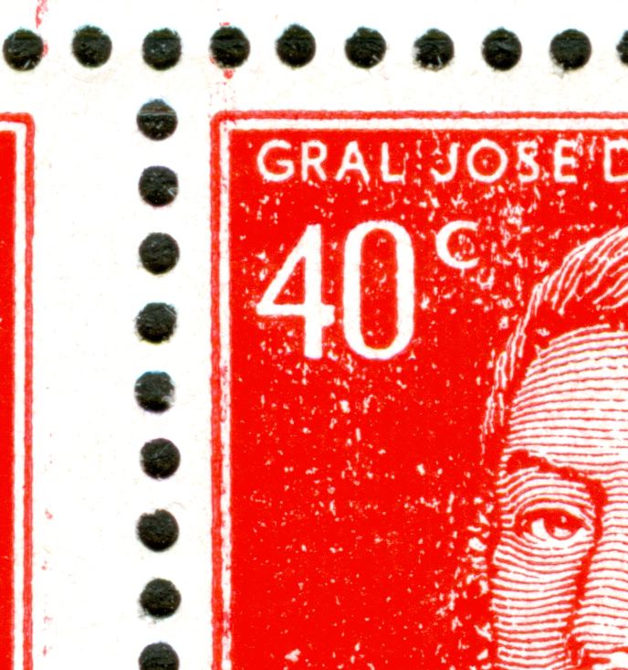
The root block of 5x2 was just under my nose!
The thick "4" is number 3 in the first row!
to be continued ...
P.S.
the former owner of this block wrote "papel holandés"! What made him think so????
Re: 1954 20c and 40c José de San Martin
Publicado: 02 Ene 2012 13:46
por Otin
Rein,
Ot also appears in 7th and 9th row.
José
Re: 1954 20c and 40c José de San Martin
Publicado: 02 Ene 2012 18:08
por Rein
Otin escribió:Rein,
It also appears in 7th and 9th row.
José
José,
OK, but as we can learn from Guillermo's study, it is important to know of all occurences in the 2 sheets of 10x10!
Do you have access to complete sheets?
saludos, Rein
Re: 1954 20c and 40c José de San Martin
Publicado: 02 Ene 2012 18:32
por leonardoleidi
Now in his blogspot, you can see it better!!!!
Re: 1954 20c and 40c José de San Martin
Publicado: 04 Mar 2013 08:04
por Rein
The 40c got also printed on a sheet-fed typography press!!
The perforation is different - like that of the offset-litho printed stamps!
And the direction of paper is the first characteristic to be observed! A horizontal direction of paper!
What I had not seen before was the use of TWO different type of paper!
The asymmetrical Zárate paper and the symmetrical one!
Asymmetrical:
Symmetrical:
to be continued ...