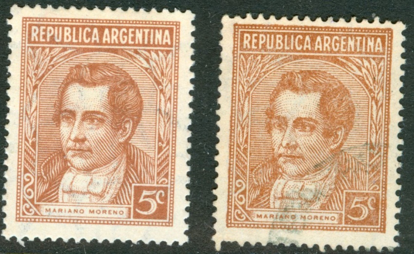
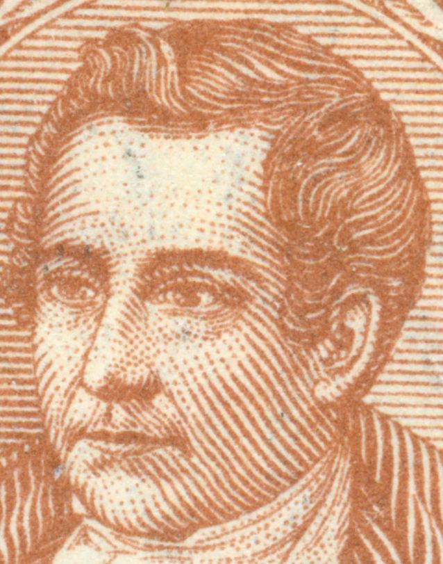
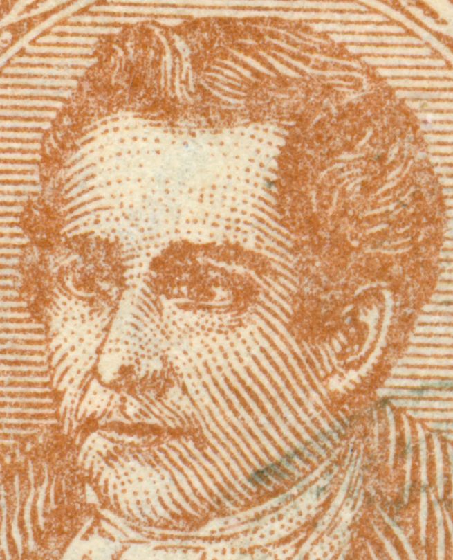
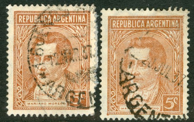
The 20c G. Brown nor the 5c J. Hernandez had been mentioned in official modifications of the P&R I series. On the contrary, they have been explicitly mentioned - by the Post Office - in the same Decree dated 31/7/56 Nº 13.389 as 22 stamps to be part of the so-called P&R II set!Otin » 29 May 2010 00:21 escribió:
Rein,
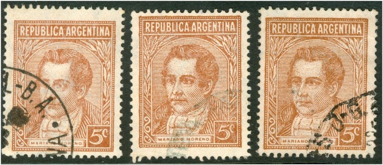
El 20c Brown violeta no puede ni debe ser incluido en PyR 1 por el sólo hecho de parecerse al diseño de esa serie. Tampoco el 5c Hernández. Los sellos de PyR I fueron emitidos en virtud de un decreto y otros que ordenaron las modificaciones, cambios de colores y valores complementarios (35c, 5c JSM rojo, 3c Moreno gris) etc.
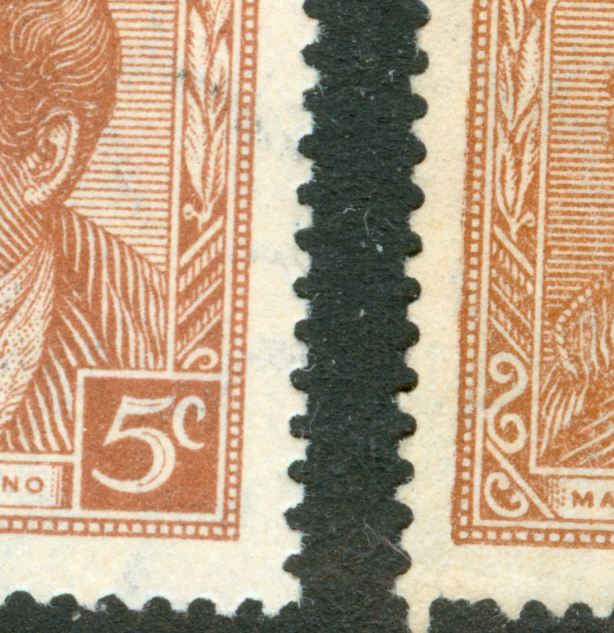
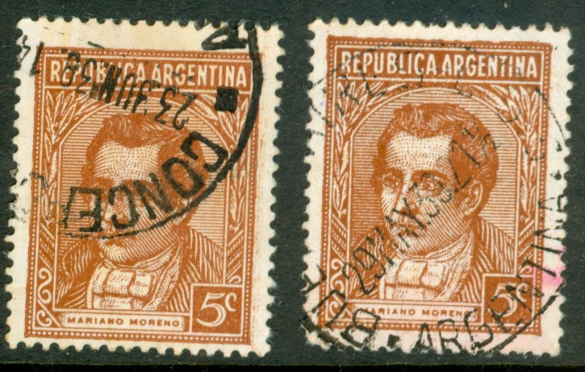
Los mencionados Brown y Hernández pertenecen a decretos aparecidos varios años después, como valores de las series ordinarias en curso. Debe tenerse en cuenta que los decretos ordenan la emisión de determinados valores pero no indican cuál debe ser la viñeta. Esta es elegida por el Correo en combinación con la Casa de Moneda. Doy un ejemplo: el 5 pesos Cataratas del Iguazú, verde, grabado, fue emitido por el Dto. Nº 17043 del 14/9/53 y puesto en circulación el 1/12/55. Salió en papel tizado importado. En fecha 31/7/56 con Dto. Nº 13.389 se ordena emitir 22 nuevos valores de los cuales se imprimen sólo 11. En este decreto se incluye el 5c Hernández y el 20c Brown, que se ponen en circulación en las siguientes fechas: 28/10/57 y el 30/11/56 el Brown tipo I y el tipo II el 25/7/57. En papel rayado (gaufré) sale en 1958.
Dicho decreto ordena también un valor de 5 pesos. ¿Qué hizo la Casa de Moneda? Usó las planchas grabadas de 1955 que ya tenía y sacó el viejo 5p pero en papel MATE!
Para su conocimiento y para quienes esto lean, después de PyR I no vienen la II ni la iii. Para ser más claro al respecto: los sellos ordinarios emitidos en pesos moneda nacional hasta 1970 no pertenecen a un decreto que haya ordenado la serie II ni la III, sino que pertenece varios decretos que iban ajustando las tarifas a medida que la inflacióniba in crescendo. Como diríanlos ingleses. as a matter of fact (como un asunto de hecho) los decretos son 11, que van desde 1953 hasta 1967, o sea que si queremos ser precisos, y así debe ser, los valores de cada decreto constituyen una serie en sí misma y así debieran estar catalogadas. A título de curiosidad doy un dato: el sello de 300 pesos está incluido en el decreto anterior pero no se imprimió. Apareció recién el 5/2/62 con la viñeta Mar del Plata porque así lo estableció el Dta. Nº 6242 del 28/7/61 en el papel tizado con sol redondo y con sol ovalado. Un nuevo decreto Nª 8595 del 24/8/62 ordena otra vez el 300p y la Casa de Moneda lo vcuelve a imprimir pero en papel tizado nacional.
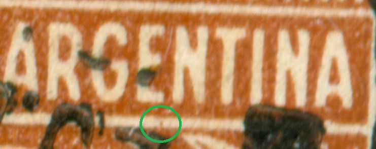
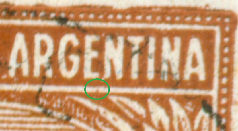
Ven Uds. que un mismo sello, pero con papel cambiado, pertenece a distintas series, o decretos si lo prefieren.
Rein: I hope Google will take care of the translation.
Buenas noches!
Merlo
On formal grounds José Merlo has it right, but otherwise there is every reason to include these stamps! Both the 20c and the 5c
to be continued ...