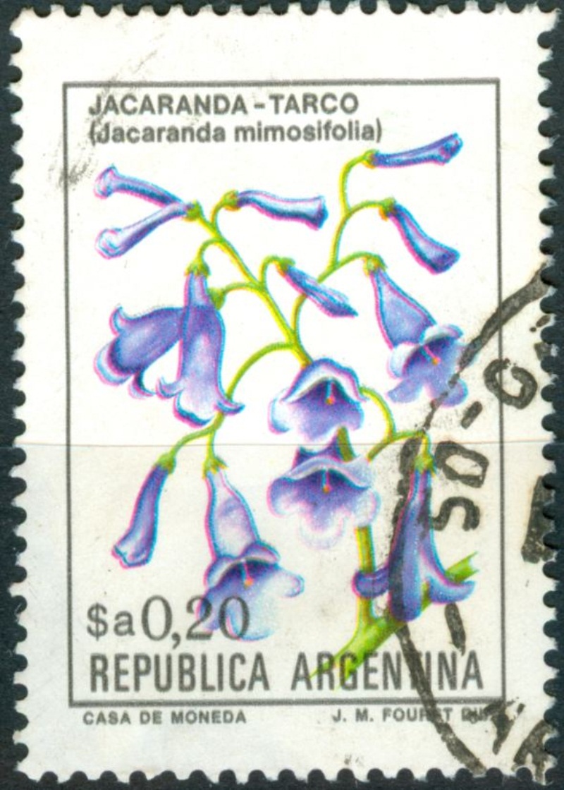
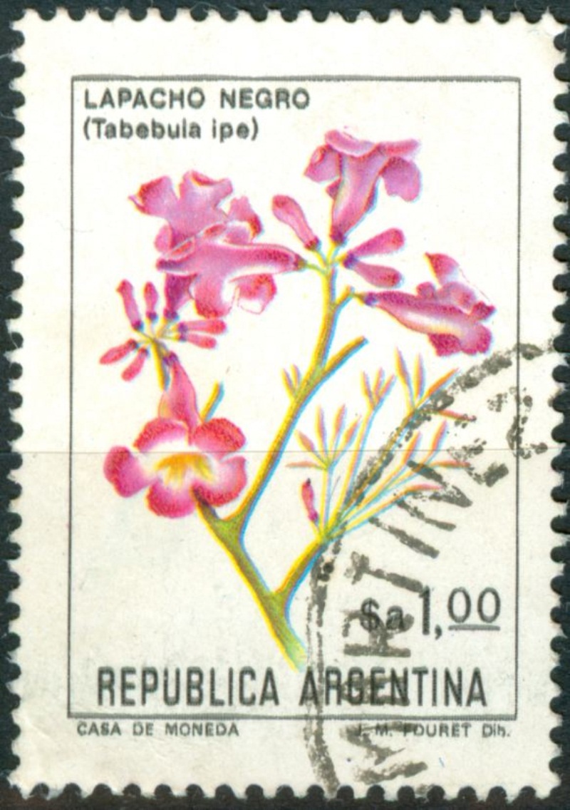
There are several dimensions according to we can classify the Flowers and other definitves in this period.
- The intensity of the OBA's in coating and pulp varies;
- the thickness varies 80-120μ;
- the intensity of the varnish;
- the way the coating had been applied - by whom, where and when?? - shows several aspects:
++ smooth surface - plus micro holes;
++ smooth surface without any or just a few round, somewhat larger holes;
++ rough surface -crayish - with a number of "flakes" peeled off to a lesser or greater extent (as we saw in the Fungi stamps to an extreme extent!).....
Only a few aspects have discrete dimensions:
- phosphorescence vs non-phosphorescence
- micro holes vs no micro holes
The Flowers sets can only be compared to a few commemoratives and other defintives in the 1982-1994 period. We should study them as well in order to make a sensible classification....
1982-1984 Flowers galore
Moderador: Rein
-
Rein

- Usuario Colaborador

- Mensajes: 6258
- Registrado: 13 Mar 2009 15:59
- Ubicación: Leiden, Netherlands
- Contactar:
Re: 1982-1984 Flowers galore
Martin,ntrm » Today 01:06 escribió:
Rein, no se si se ve bien, pero yo llamo "salpicado" a esto:
No esta perfecta pero creo se entiende...
Martin
the picture just tells me there is at least a lot of fluorescence [blue] in the coating and maybe some phosphorescence at the bottom [yellowish tinge].
If I am right and that is what you mean, it tells something about the way the phosphorescence got applied - this time in a flawed way - separately.
-
Rein
- Usuario Colaborador
- Mensajes: 6258
- Registrado: 13 Mar 2009 15:59
- Ubicación: Leiden, Netherlands
- Contactar:
Re: 1982-1984 Flowers galore
Martin,ntrm » Today 01:18 escribió:
Hola, abro este post para no "dispersar" los otros...
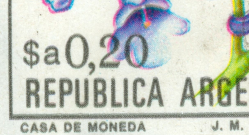
Miren como se corre la tinta (o desparrama) sobre la cifra del sello
Martin
the direction of printing is always with the ink flowing upwards in the Flowers stamps, this stamp is no exception
-
Rein
- Usuario Colaborador
- Mensajes: 6258
- Registrado: 13 Mar 2009 15:59
- Ubicación: Leiden, Netherlands
- Contactar:
Re: 1982-1984 Flowers galore
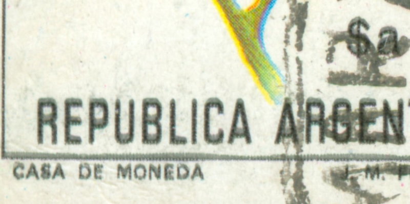
Direction of printing for the black colours!
-
Rein
- Usuario Colaborador
- Mensajes: 6258
- Registrado: 13 Mar 2009 15:59
- Ubicación: Leiden, Netherlands
- Contactar:
Re: 1982-1984 Flowers galore
The direction of printing is still subject of some discussion!Rein escribió:Direction of printing for the black colours!
A 5th colour for the grey shadows is what Omar is suggesting!villa56 » 26 Jan 2011 09:53 escribió:
Hola de nuevo a todos. Creo que la voy a liar un poco. Espero que "piensen" antes de contestar . Me voy a referir solamente a este sello.
Son 10 ejemplares. Los 5 de arriba y el primero por la izquierda de abajo, fosforescentes (gracias Luis). Los 4 últimos, fluorescentes.
.
Ahora viene mi hipótesis:
Los sellos fosforescentes fueron impresos en máquina de 5 cuerpos, es decir: Cyan, Amarillo, Magenta, "gris" y negro.
Esta última plancha de negro solamente en las letras y números y algunos detalles para intensificar color y sombras.
Como vemos hay un gris con trama más tupida que la segunda impresión del negro con trama más abierta (puntos y espacios mayores).
En la siguiente imagen vemos el desplazamiento (para mí, mal registro del gris y el negro) en el número 3. Pero si nos fijamos en 1, solamente vemos una pequeña "sombra" gris (mal registrada con los otros 3 colores). Pero no aparece un negro por debajo como tendría que ser. Sin embargo en 2, sí aparece debajo del gris una trama de negro. Para intensificar color y dar profundidad a la flor. Comprobé esta trama y es exactamente igual a la trama del negro de las letras y números. En grado y separación.
Sigo en el siguiente post.
villa56
to be continued ....
-
Rein
- Usuario Colaborador
- Mensajes: 6258
- Registrado: 13 Mar 2009 15:59
- Ubicación: Leiden, Netherlands
- Contactar:
Re: 1982-1984 Flowers galore
villa56 » 26 Jan 2011 10:01 escribió:
Ahora vamos con el fluorescente (gracias Luis ). En primer lugar vemos que ya no hay "gris". Solamente puntos negros y blanco.
Si comparamos fosfo y fluo, vemos que la trama primera del negro no tiene nada que ver con el negro del fluo.
Si vemos un detalle mal registrado en la flor, vemos que no existe el gris y hay solamente punto negros plenos.
Como conclusión y espero no "ofender" a nadie y siempre en mi modesta opinión, estos sellos se imprimieron con distintas técnicas.
El fosforescente a cinco colores y el fluorescente a 4 tintas.
SI APARECE ALGÚN SELLO FLUORESCENTES CON LAS LETRAS "BORROSAS", ACEPTARÍA MI EQUIVOCACIÓN.
Why does the grey comes out only in the phosphorescent stamps and not in the fluorescent ones???
to be continued .....
-
Rein
- Usuario Colaborador
- Mensajes: 6258
- Registrado: 13 Mar 2009 15:59
- Ubicación: Leiden, Netherlands
- Contactar:
Re: 1982-1984 Flowers galore
I did give Omar the suggestion to read my general thread on the Direction of Printing!villa56 » 26 Jan 2011 12:07 escribió: Gracias amigo Rein por tu MP. Desconocía que ya habían tratado este tema en este post:
viewtopic.php?f=139&t=3519
Seguramente es esto lo que ocurre y no las 5 "tintas". Pero me sigue la duda porqué no ocurre en los fluorescentes.
Perdón por vuestro tiempo. Seguimos aprendiendo .
Omar.
viewtopic.php?f=139&t=3519
to be continued ....
-
Rein
- Usuario Colaborador
- Mensajes: 6258
- Registrado: 13 Mar 2009 15:59
- Ubicación: Leiden, Netherlands
- Contactar:
Re: 1982-1984 Flowers galore
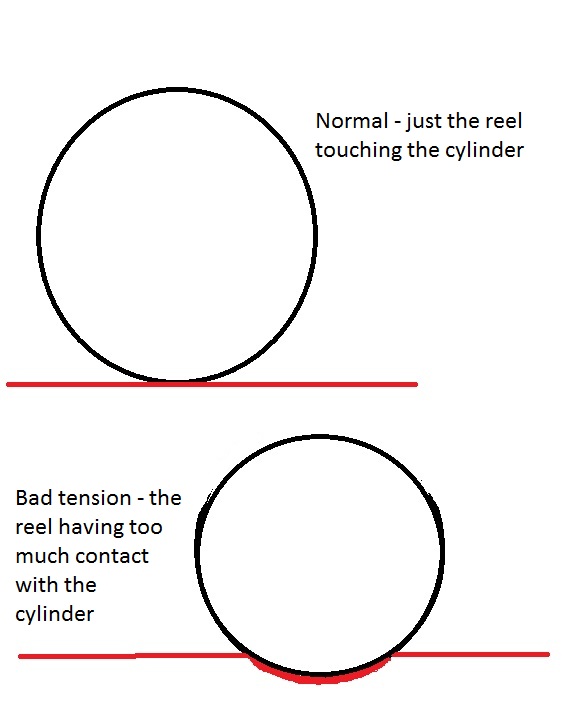
According to José Merlo the excessive flow of ink is due to a bad tension of the paper making the cylinder not just touch the reel but sticking to it for a split second...Otin » 29 Jul 2010 19:03 escribió: En el sello de letras nítidas el cyan y el magenta estãn fuera de registro. En el de letras borrosas todos los colores están en perfecto registro. Las letras salieron borrosas porque seguramente el cilindro de impresión del color negro estaba imprimiendo desajustado o el papel que llegaba a ese color no tenía la tensión suficiente y entonces "patina". En otras palabras, el contacto del papel debe ser una tangente, o sea que cuando el cilindro impresor lo toca debe hacerlo en un solo punto de la circunferencia que constituye la sección del cilindro. Es evidente que aquí ese contaco fue mayor y me imagino que le faltaba tensión al papel. Saludos.
Merlo
to be continued . ....
-
Rein
- Usuario Colaborador
- Mensajes: 6258
- Registrado: 13 Mar 2009 15:59
- Ubicación: Leiden, Netherlands
- Contactar:
Re: 1982-1984 Flowers galore
Otin » 27.01.2011 21:33 escribió: Omar:
La máquina Goebel usada para la impresión de esta serie tenía solo tres cilindros para los colores y uno para el negro. No había lugar para uno del "gris". La observación sobre la absorción de tinta según el papel es muy respetable pero ahora ya es muy difícil comprobarlo. Merlo
Otin
The question why just the phosphorescent paper [or to a much lesser degree this phenomenon - of excessive ink flow - occurs in fluorescent paper] is somehow clear now. The paper tension was different.villa56 » 28.01.2011 05:50 escribió:
Muchas gracias Sr. Merlo por su tiempo... y ya que estamos ... en los ejemplares que tengo de esta serie $a (pocos ),
siempre ocurre esta "aparición" del gris en los fosforescente. En los fluo, no. Es cuestión de papeles?. Si es así, en esta serie, tenemos fácil distinguir fosfo de fluo, sin utilizar lámpara, no?.
Muchas gracias nuevamente. Omar.
to be continued ....
-
Rein
- Usuario Colaborador
- Mensajes: 6258
- Registrado: 13 Mar 2009 15:59
- Ubicación: Leiden, Netherlands
- Contactar:
Re: 1982-1984 Flowers galore
Photogravure stamps ALWAYS have a preferential direction in which the ink is flowing NO MATTER what the PAPER TENSION is!
The ink is flowing to the left:
The ink is flowing to the right:
You can clearly see the horizontal waves the ink forms as well!
This can happen when the printing cylinders get mounted the other way around; should the directions of printing have been perpendicular then we certainly have 2 different cylinders used. I will show some examples of that later..
to be continued ....