The Netherlands - Queen Juliana 1969 definitives

Topics about Argentina Philately in english language.

Moderador: Rein

Responder
Avatar de Usuario
Rein
Usuario Colaborador
Usuario Colaborador
Mensajes: 6258
Registrado: 13 Mar 2009 15:59
Ubicación: Leiden, Netherlands
Contactar:

The Netherlands - Queen Juliana 1969 definitives

Mensaje por Rein »

One of the most intriguing definitive series of the Netherlands is the one starting in 1969 with a portrait of our Queen used by Sem Hartz for his stamp design!

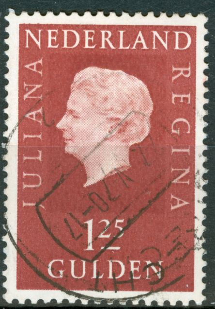
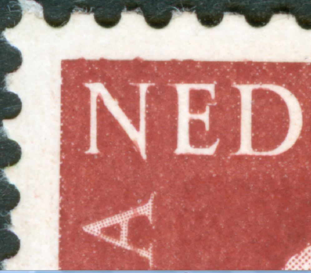
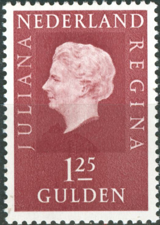
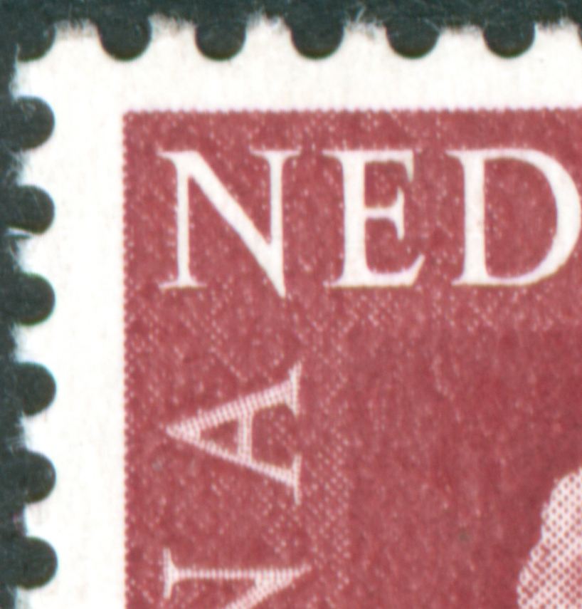
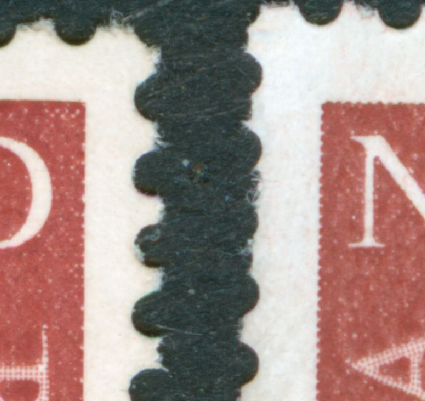
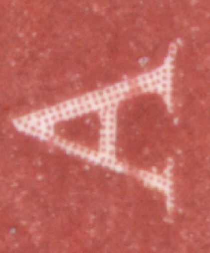
The original first values issued in 1969 were the 25c only available in bookets of 4 and the 1Guilder25 issued in counter sheets of 10x5. Other high values were issued later on but what no one seems to realize is that by then the design had been changed!

This change of design did not find its way into the catalogues or handbooks and since stamp collectors are faithful only to what is in these books will not likely realize what they have in their surplus of stamps to be traded or swapped! Often not having these stamps in their collection at all!

I consider this a general feature [or flaw ;) ] in the attitude of philately - all over the world not just Argentina or the Netherlands!

The experts also would not bother about them either and neither do the jurors in (inter)national exhibitions! What is not in the book does not exist, cannot be valued and not be a reason to be given extra points ....

In another thread here in this Foro I pointed out the fact that German collectors preferred to have a 25 mancos / missing stamps in their DDR collection rather than questioning the Authority of their National Philatelic Bible Michel! It is the other of two sides of the same story!

to be continued ....
Avatar de Usuario
Rein
Usuario Colaborador
Usuario Colaborador
Mensajes: 6258
Registrado: 13 Mar 2009 15:59
Ubicación: Leiden, Netherlands
Contactar:

Re: The Netherlands - Queen Juliana 1969 definitives

Mensaje por Rein »

The 1 guilder 25c:

In type I with a very thin outline - not only within the stamp design around the text, but also around the very outer edge!

Imagen


Imagen

Around the text you can see the straight outlines - nothing like a tooth-like screen we are so familiar with - and as an extra feature "little white circles just immediately above the outline of the "N"and the "E" [and all other text characters!] This has to do with the ink flowing upwards! The white circles beneath the characters had been filled up!

to be continued ...

P.S.

this stamp has a real double impression! of the circular date stamp, that is :)
Avatar de Usuario
Rein
Usuario Colaborador
Usuario Colaborador
Mensajes: 6258
Registrado: 13 Mar 2009 15:59
Ubicación: Leiden, Netherlands
Contactar:

Re: The Netherlands - Queen Juliana 1969 definitives

Mensaje por Rein »

However, in type II the very thin outline of the outer edge had been removed and the outlines were left only within the stamp design around the text.

Imagen


Imagen


The regular teeth of the screen can be seen as usual along the outer edge!

Imagen


At the left type I and at the right type II!

to be continued ....

P.S.

the screen in the text Is with different angles than elsewhere in the design! This is because the screen is part of the design and had NOT been applied afterwards while reproducing the design with a step-and-repeat machine. It was introduced in the Netherlands with the phrase "autotypical photogravure"! This not quite correct - and I hope Otin will agree with me - as the autotypical screen or surface-variable screen is a screen similar to that was is used in offset-litho! The traditional photogravure screen is depth-variable with the screen dots having the same surface area everywhere but with the depth of the hole being different... The autotypical screen has holes that are equally deep everywhere but the surface area may differ!


Imagen

Imagen
Responder

Volver a “Argentina Philately in the language of Shakespeare”