José and Tony,Otin » 15.04.2010 14:26 escribió:
Rubiera:
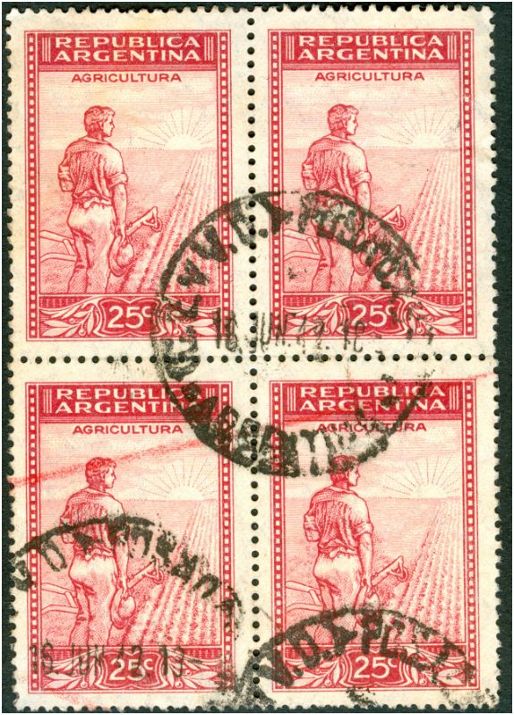
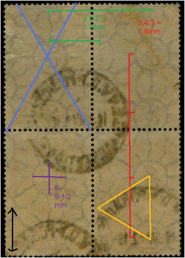
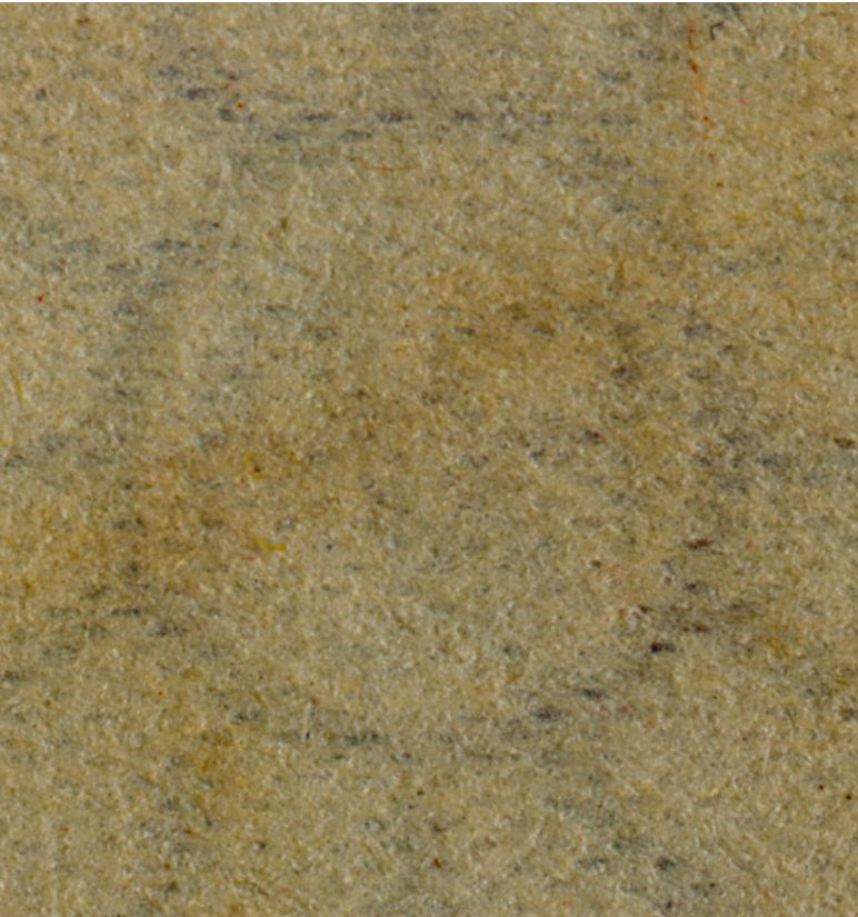
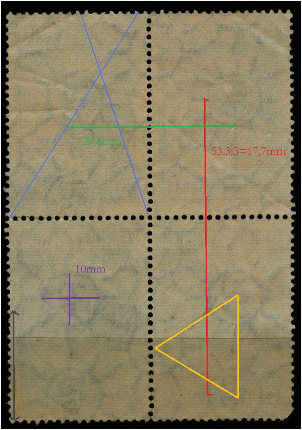
Desde ya lo felicito muy cálidamente por el hallazgo del 2p frutas en papel de rayos gruesos difusos. Creo que aquí en Argentian nadie los tiene catlogados e incluso creo que Moscatelli no lo tiene. Precisamente porque Moscatelli hizo su colección basado en mi monografía de 1966 me atrevo a sugerir a Ud. trate de conseguirla. Ello le aclarará el panorama pués alli se encuentran detallados todos los papeles tanto mates como tizados y los Zárate. Se indican posiciones de filigranas, medidas de los diámetros de los soles, altura y longitud de ls RA y un montón de cosas más. El ordenamiento está hecho en orden cronológico de modo que paso del papel inglés al holandés, etc. En ese orden están los tizados y luego los Zárate. Fue publicado en el Nº 2 de los cuadrnos de Cesca y tengo entendido que Rein lo tiene.
Como después lo publiqué en las revistas de la ahora SOFIRA yo se las podría mandar pero es tan elevado el costo del franqueo que del mismo tendría que hacerse cargo Ud. y desde luego enviarme su dirección postal.
De esta manera hablaríamos todos el mismo idioma pues aquí todos los coleccionistas de esta serie se basan en mi clasificación, con algunas modificacioned, pués después de la publicación la Casa de Moneda me dió muestras de los papeles con sus orígines y alguna especificación, con lo cual los nombres con los que yo los había "bautizado" quedaron algunos que todavía se usan pero otros ya fueron cambiados, por ejemplo en mi trabajo original llamo "rayos largos ondulados" al que luego resultó ser papel austríaco y así otros.
Si Ud. usa Skipe podemos charlar mediante la web cam. Yo figuro ahí como josé.ramón.merlo. Creo que nos serámuy útil.
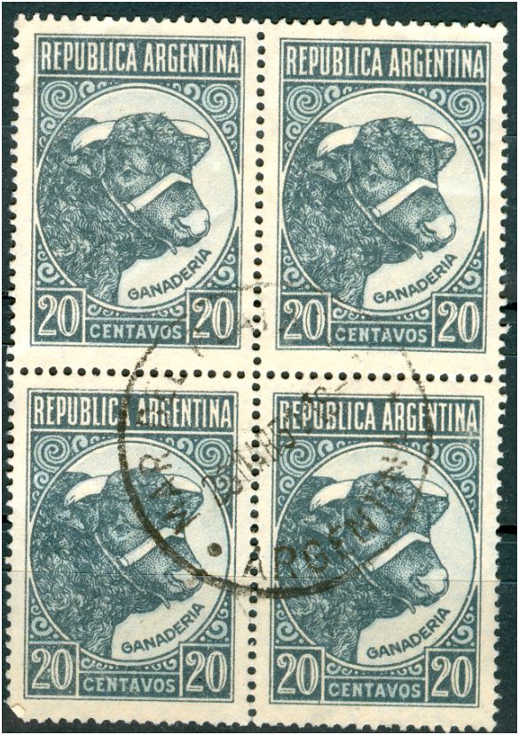
Espero su respuesta y lo que Ud. dice respecto a que tiene el 5c y 10c tipografiado en papel mate lustroso confirma que el sello del sobre de Moscatelli existe, pese a que Rein dice (sin decirlo) que es un invento mío.
Lo saludo muy cordialmente.
Merlo
there is no need at this moment to fight over the types of paper without having done additional research on the stamps themselves or having reliable information from the Casa de Moneda.
The types of paper as published by Dario Bardi in his catalogue is a very good basis to start with. We need to do some tuning maybe as some distinguishable types are not yet embodied in his classification.
to be continued ....