Double impression or preferential ink flow?

Topics about Argentina Philately in english language.

Moderador: Rein

Avatar de Usuario
Rein
Usuario Colaborador
Usuario Colaborador
Mensajes: 6258
Registrado: 13 Mar 2009 15:59
Ubicación: Leiden, Netherlands
Contactar:

Double impression or preferential ink flow?

Mensaje por Rein »

Argentina philately has a few idiosyncrasies you will not find elsewhere!

It has been fostered by a league of stamp dealers and their catalogues like Kneitschel, Klass, Petrovich, Samowerskij, Mello Teggia and Gottig/Jalil!

It is the notion or phenomenon of "double impression". It needs to be found in every stamp and if you haven't found it your collection is below standard! :)

What it is??? That depends on the method of printing! And the knowledge of printing techniques is hardly ever present amidst philatelists. What the eye can see and looks like being different from what otherwise apparently the same stamps have is worth collecting and makes you collection stand out....

So far in Argentina philately it seems there has been only ONE person with a great, laudable knowledge of printing methods who has written an excellent book about it

How many wil have read "Los Sistemas de Impresión en Filatelia" by José Ramón Merlo?

to be continued ....
Avatar de Usuario
Rein
Usuario Colaborador
Usuario Colaborador
Mensajes: 6258
Registrado: 13 Mar 2009 15:59
Ubicación: Leiden, Netherlands
Contactar:

Re: Double impression or preferential ink flow?

Mensaje por Rein »

"Double Impression" implies that the printing has been applied twice i.e. the sheet went through the press twice! Mistakes can be made everywhere but this type of mistakes can only be expected in primitive printing houses or made deliberately to please collectors... The same goes for a second colour plate fed up side down! Philatelists go out of their mind for such phenomena! Whereas it is simply a crude failure of the printing house - first to have it happen, second to not notice it afterwards...

Setting aside above mentioned monstruosities, what can give the impression of a "double impression???

As said before it depends on the method of printing, and it usually has to do with a shift of colour and forming of a shadow! Rarely a vague extra print set loose of the original print.

to be continued ...
Avatar de Usuario
Rein
Usuario Colaborador
Usuario Colaborador
Mensajes: 6258
Registrado: 13 Mar 2009 15:59
Ubicación: Leiden, Netherlands
Contactar:

Re: Double impression or preferential ink flow?

Mensaje por Rein »

Printing methods with a flat plate and flat bed - the print stamped/applied on a flat-lying sheet of paper - will never result in ink shifts as both sheet and printing plate are fixed horizontally, the plate moves down and up again and then the sheet disappears... Printing methods of this type can be found in stamps made by typography or recess a.o.

Printing methods with a rotating plate/cylinder and a flat bed - the cylinder rolling over a flat-lying sheet - may result in an ink shift depending on the speed of the sheet moving out of the press... It is the moving out that causes the preferential ink flow - the preferential direction always pointing towards the press...

When both the plate/cylinder and the counter-cylinder are rotating, the preferential ink flow is even more often to be found, likewise when the paper got fed by reels rather than sheets, the ink flow is a normal phenomenon.

All present-day printing methods with rotating printing cylinder may give the preferential ink flow - the reel-fed typography, offset-litho, photogravure and rotary recess...

Photogravure is the most prolific! From the very start of this method for producing postage stamps - 1914 in Munich, Bavaria, we could observe the preferential ink flow [or direction of printing as we call it now].

Strangely enough, it was first observed by a philatelist in 1972!! Before 1972 NOBODY has ever paid attention to it! Wasn't that typical for philatelists????

to be continued ....
Avatar de Usuario
Rein
Usuario Colaborador
Usuario Colaborador
Mensajes: 6258
Registrado: 13 Mar 2009 15:59
Ubicación: Leiden, Netherlands
Contactar:

Re: Double impression or preferential ink flow?

Mensaje por Rein »

The phenomenon of "direction of printing" had been discovered by Douglas Myall ("Deegam") in 1972. Myall is THE innovative philatelist specializing the UK Machin stamps writing the standard handbooks for all Machin collectors all over the world. He discovered the direction of printing as the prefential ink flow observed by comparing coil stamps and booklet stamps and the normal counter sheet stamps.

More or less simultaneoulsy the phenomenon was also discovered by Huig Tielman in the Netherlands who saw an ink flow in the 25c Queen Juliana booklet stamps printed in reels - the left half of the reel being tête-bêche to the right half of the reel. The left half had the ink flowing upwards, the right half flowing downwards! He could thus tell booklets originating from the left half from those from the right half!

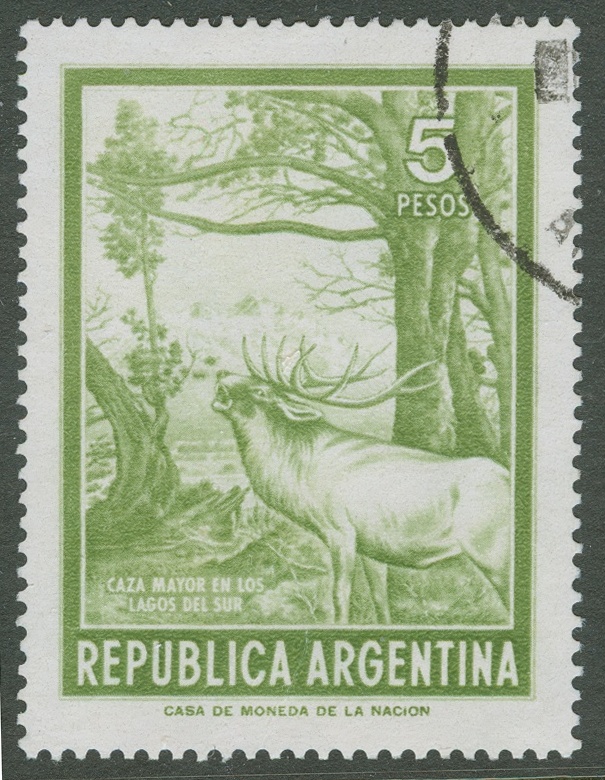
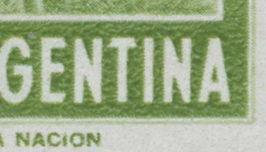
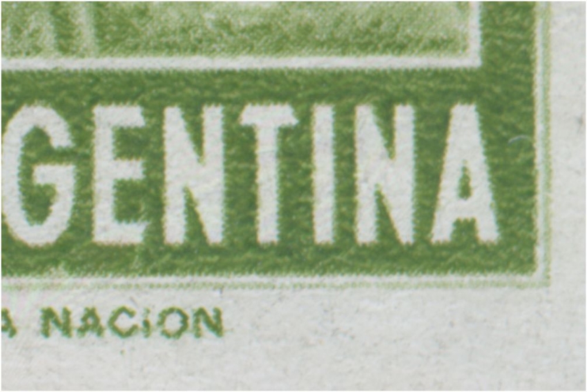
Huig Tielman inspired me to have a good look at all photogravure printed stamps and I found out that you could establish the direction of printing basically in all stamps that had been printed with cylinders. Not just in photogravure but also in offset-litho and in recess!

I gave the four directions - the preferential direction where the ink would flow - the codes B [oven = upwards], O [onder = downwards], L [to the left] and R [ to the right]. I have been using this way of denoting the directions of printing since 1974.

Imagen

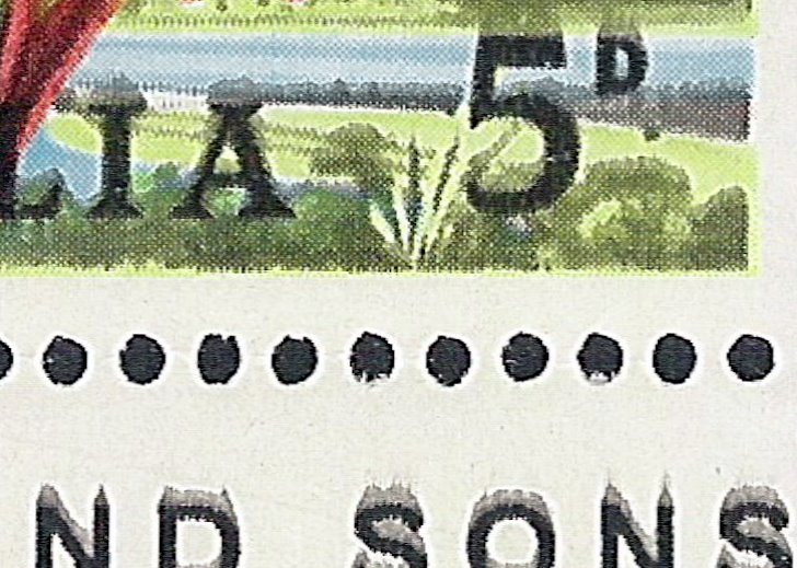
The Australian stamps printed in photogravure by Harrison show the ink flowing upwards. In this stamp the ink flow is quite spectacular, whereas most photogravure stamp will not show it this way!

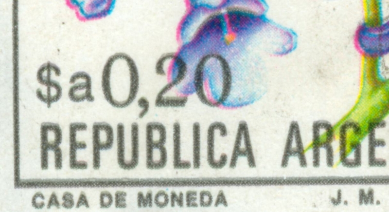
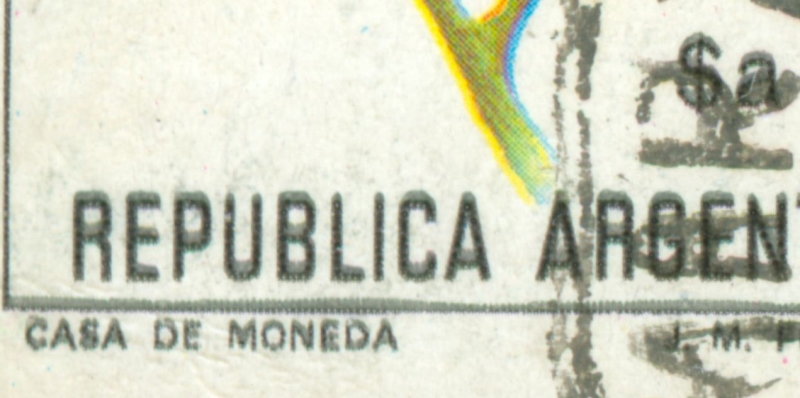
The colour is usually a fade shade of the original colour - rather grey than black in the stamp shown above!

The ink of photogravure being rather fluid contains pigments that will stay at their place whereas the fluids will tend to move

to be continued ...
Avatar de Usuario
Rein
Usuario Colaborador
Usuario Colaborador
Mensajes: 6258
Registrado: 13 Mar 2009 15:59
Ubicación: Leiden, Netherlands
Contactar:

Re: Double impression or preferential ink flow?

Mensaje por Rein »

Argentina stamps had been printed since 1939 - first on the Mailander sheet-fed press, since 1968 on a Goebel reel-fed press.

The first Argentina postage stamps in which I observed the direction of printing were the Stag stamps!

Imagen

The ink is flowing to the left :

Imagen

The ink is flowing to the right

Imagen

You can clearly see the horizontal waves the ink forms as well!

To have found stamps with an oppositie direction of printing can be explained by the fact that printing cylinders get mounted the other way around.

Should the directions of printing have been perpendicular then we certainly have 2 different cylinders used. This happened quite often in the P&R II/III series!

to be continued ...
Avatar de Usuario
Rein
Usuario Colaborador
Usuario Colaborador
Mensajes: 6258
Registrado: 13 Mar 2009 15:59
Ubicación: Leiden, Netherlands
Contactar:

Re: Double impression or preferential ink flow?

Mensaje por Rein »

The phenomenon of the direction of printing gets easily misinterpreted thanks to the Argentine "double impression" mania
stamps9407 escribió:
Hola, encontré este sello, donde parece que hay o una doble impresión del azul o un corrimiento de tinta?, su oponión es apreciada

Imagen

1044b - Doble impesión del azul

Saludos
Sergio
Sergio,

it is not a "double impression"! The ink flows in a particular preferential direction as shown here above in the Australian stamp and the Stags stamps!

to be continued ...
Avatar de Usuario
Rein
Usuario Colaborador
Usuario Colaborador
Mensajes: 6258
Registrado: 13 Mar 2009 15:59
Ubicación: Leiden, Netherlands
Contactar:

Re: Double impression or preferential ink flow?

Mensaje por Rein »

Another example:

juso escribió:Esta es mi ultima adquisicion el raro tizado F/F 1169a 30p "Colecciones sellos postales", ademas de este esta el tizado F/N, el neutro N/N y los mates.Al estudiarlo me encontre con estas caracteristicas que muestro en el grafico siguiente comparandolo con el otro tizado F/N, entonces me surgieron las siguientes preguntas:
Porque me muestra dos colores en cada detalle de la viñeta?...es como primero se imprimio el color verde-amarillento y despues el verde oscuro pero desfasado de aquel, y la cosa viene de abajo hacia arriba, cosa que no ocurre con el F/N?, el porque de la mancha en el borde inferior del sello?....el ejemplar que tengo esta Mint....por eso deduszco que hay un error de impresion....ahora....solo se dio en esta plancha donde viene este sello ? o me sirve como patron general para identificarlo de los otros, es decir del F/N, utilizando estas caracteristicas para identificarlo sin utilizar la lampara UV ?, porque si no es asi , este seria una variedad y buscaria otro para compararlo. Si alguien tiene este sello comparelo y por favor diganme si es igual al que tengo o no, para poder esclarecer estas dudas que tengo con respecto a este hermoso sello de los papeles modernos....

Imagen

saludos....

javier

Javier!

the 30c you displayed has been printed on normal coated paper! That is, the so-called "mate" is also coated but with a heavy layer of "clay" that reacts "strange" to the green ink. This modified paper hardly allows the ink to flow in a particular direction as it normally should - especially as these stamps have been printed on the Goebel reel-fed printng press!

There is NO second colour! This phenomenon is called "direction of printing" and was noticed about 1973 by Douglas Myall for the UK Queen Elisabeth Machin stamps!


to be continued ...
Avatar de Usuario
Rein
Usuario Colaborador
Usuario Colaborador
Mensajes: 6258
Registrado: 13 Mar 2009 15:59
Ubicación: Leiden, Netherlands
Contactar:

Re: Double impression or preferential ink flow?

Mensaje por Rein »

Some more:
Rein escribió:Direction of printing for the black colours!

Imagen
Imagen
Imagen
Imagen
The direction of printing is still subject of some discussion!
villa56 » 26 Jan 2011 09:53 escribió:
Hola de nuevo a todos. Creo que la voy a liar un poco. Espero que "piensen" antes de contestar . Me voy a referir solamente a este sello.
Son 10 ejemplares. Los 5 de arriba y el primero por la izquierda de abajo, fosforescentes (gracias Luis). Los 4 últimos, fluorescentes.

Imagen
.
Ahora viene mi hipótesis:

Los sellos fosforescentes fueron impresos en máquina de 5 cuerpos, es decir: Cyan, Amarillo, Magenta, "gris" y negro.
Esta última plancha de negro solamente en las letras y números y algunos detalles para intensificar color y sombras.
Como vemos hay un gris con trama más tupida que la segunda impresión del negro con trama más abierta (puntos y espacios mayores).

Imagen

En la siguiente imagen vemos el desplazamiento (para mí, mal registro del gris y el negro) en el número 3. Pero si nos fijamos en 1, solamente vemos una pequeña "sombra" gris (mal registrada con los otros 3 colores). Pero no aparece un negro por debajo como tendría que ser. Sin embargo en 2, sí aparece debajo del gris una trama de negro. Para intensificar color y dar profundidad a la flor. Comprobé esta trama y es exactamente igual a la trama del negro de las letras y números. En grado y separación.

Imagen

Sigo en el siguiente post.

villa56
A 5th colour for the grey shadows is what Omar is suggesting!

to be continued ....
Avatar de Usuario
Rein
Usuario Colaborador
Usuario Colaborador
Mensajes: 6258
Registrado: 13 Mar 2009 15:59
Ubicación: Leiden, Netherlands
Contactar:

Re: Double impression or preferential ink flow?

Mensaje por Rein »

villa56 » 26 Jan 2011 10:01 escribió:
Ahora vamos con el fluorescente (gracias Luis ). En primer lugar vemos que ya no hay "gris". Solamente puntos negros y blanco.

Imagen

Si comparamos fosfo y fluo, vemos que la trama primera del negro no tiene nada que ver con el negro del fluo.

Imagen

Si vemos un detalle mal registrado en la flor, vemos que no existe el gris y hay solamente punto negros plenos.

Imagen

Como conclusión y espero no "ofender" a nadie y siempre en mi modesta opinión, estos sellos se imprimieron con distintas técnicas.
El fosforescente a cinco colores y el fluorescente a 4 tintas.
SI APARECE ALGÚN SELLO FLUORESCENTES CON LAS LETRAS "BORROSAS", ACEPTARÍA MI EQUIVOCACIÓN.

Why does the grey comes out only in the phosphorescent stamps and not in the fluorescent ones???

to be continued .....
Avatar de Usuario
Rein
Usuario Colaborador
Usuario Colaborador
Mensajes: 6258
Registrado: 13 Mar 2009 15:59
Ubicación: Leiden, Netherlands
Contactar:

Re: Double impression or preferential ink flow?

Mensaje por Rein »

villa56 » 26 Jan 2011 12:07 escribió: Gracias amigo Rein por tu MP. Desconocía que ya habían tratado este tema en este post:

viewtopic.php?f=139&t=3519

Seguramente es esto lo que ocurre y no las 5 "tintas". Pero me sigue la duda porqué no ocurre en los fluorescentes.
Perdón por vuestro tiempo. Seguimos aprendiendo .
Omar.
I did give Omar the suggestion to read this general thread on the Direction of Printing!
Otin » 29 Jul 2010 19:03 escribió: En el sello de letras nítidas el cyan y el magenta estãn fuera de registro. En el de letras borrosas todos los colores están en perfecto registro. Las letras salieron borrosas porque seguramente el cilindro de impresión del color negro estaba imprimiendo desajustado o el papel que llegaba a ese color no tenía la tensión suficiente y entonces "patina". En otras palabras, el contacto del papel debe ser una tangente, o sea que cuando el cilindro impresor lo toca debe hacerlo en un solo punto de la circunferencia que constituye la sección del cilindro. Es evidente que aquí ese contaco fue mayor y me imagino que le faltaba tensión al papel. Saludos.
Merlo
According to José Merlo the excessive flow of ink is due to a bad tension of the paper making the cylinder not just touch the reel but sticking to it for a split second...

Imagen

to be continued . ....
Avatar de Usuario
Rein
Usuario Colaborador
Usuario Colaborador
Mensajes: 6258
Registrado: 13 Mar 2009 15:59
Ubicación: Leiden, Netherlands
Contactar:

Re: Double impression or preferential ink flow?

Mensaje por Rein »

Otin » 27.01.2011 21:33 escribió: Omar:
La máquina Goebel usada para la impresión de esta serie tenía solo tres cilindros para los colores y uno para el negro. No había lugar para uno del "gris". La observación sobre la absorción de tinta según el papel es muy respetable pero ahora ya es muy difícil comprobarlo. Merlo

Otin
villa56 » 28.01.2011 05:50 escribió:
Muchas gracias Sr. Merlo por su tiempo... y ya que estamos ... en los ejemplares que tengo de esta serie $a (pocos ),
siempre ocurre esta "aparición" del gris en los fosforescente. En los fluo, no. Es cuestión de papeles?. Si es así, en esta serie, tenemos fácil distinguir fosfo de fluo, sin utilizar lámpara, no?.
Muchas gracias nuevamente. Omar.
The question why just the phosphorescent paper [or to a much lesser degree this phenomenon - of excessive ink flow - occurs in fluorescent paper] is somehow clear now. The paper tension was different.


Photogravure stamps ALWAYS have a preferential direction in which the ink is flowing NO MATTER what the PAPER TENSION is!

to be continued ....
Avatar de Usuario
Rein
Usuario Colaborador
Usuario Colaborador
Mensajes: 6258
Registrado: 13 Mar 2009 15:59
Ubicación: Leiden, Netherlands
Contactar:

Re: Double impression or preferential ink flow?

Mensaje por Rein »

Rein » 28 Mar 2009 20:27 escribió:
"Para terminar una pregunta.......estoy en la duda si es un doble impresion o impresion "corrida"......Uds que opinan??"

The 1P has at least two cylinders. One with a horizontal axis which gives a printing direction upwards or downwards and a vertical axis which gives the printing direction towards the left or towards the right. The latter gives a nice result of ink flowing to the right making you believe to have a "double inpresssion". Scans will follow!

El 1p fue impreso con al menos 2 cilindros impresores. Uno con un eje Horizontal que hace que la direccion de impresion del sello sea hacia arriba o hacia abajo y otro con eje vertical qhace que se impriman los sellos hacia la izquierda o hacia la derecha. Este ultimo da un bonito resultado de desplazamiento de tinta hacia la derecha haciendo parecer que existe una doble impresion. En breve aportare escaneos.
to be continued ....
Avatar de Usuario
Rein
Usuario Colaborador
Usuario Colaborador
Mensajes: 6258
Registrado: 13 Mar 2009 15:59
Ubicación: Leiden, Netherlands
Contactar:

Re: Double impression or preferential ink flow?

Mensaje por Rein »

Rein » 29 Mar 2009 13:16 escribió:This stamp is supposed to hve been printed on national paper only [J.Holler] but the quality is rather bad. To start with, the wire side of the paper was used for printing - which is a mistake printers should not make, but what happened quite often ;) - so the side where the Multiple Sun+AЯ was visible [the gummed side] is now at the front leaving us with a gummed side that has Multiple + Sun+RA!! Is that what we see??? if it is still "AЯ" it means the watermark itself has changed.....

The indents of the paper wire (granulados) are clearly visible at the front:

Imagen

The ink is flowing towards the right:

Imagen

Just at the right border of the coloured frame you can see a vertical thin brown line:

Imagen

The blue of the "Servicio oficial" is clearly screened! This is no overprint! Bi-coloured photogravure!

Imagen
to be continued ....
Avatar de Usuario
Rein
Usuario Colaborador
Usuario Colaborador
Mensajes: 6258
Registrado: 13 Mar 2009 15:59
Ubicación: Leiden, Netherlands
Contactar:

Re: Double impression or preferential ink flow?

Mensaje por Rein »

Rein» 29 Mar 2009 13:36 escribió:
Imagen

The earlier printings have the direction of printing vertically. With this rather badly printed stamp it is not easy to establish the direction but with some luck there are doctor's blades lines to see - the doctor's blade is scraping the superfluous ink of the cylinder - the tiny vertical brown lines:

Imagen

The axis of the printing cylinder must have been horizontal...

The paper was just as bad....
to be continued ....
Avatar de Usuario
Rein
Usuario Colaborador
Usuario Colaborador
Mensajes: 6258
Registrado: 13 Mar 2009 15:59
Ubicación: Leiden, Netherlands
Contactar:

Re: Double impression or preferential ink flow?

Mensaje por Rein »

I am just quoting this postings as there is still an enormous antipathy against the notion of "direction of printing" and its high potential of distinguishing different printings of apparently the same stamp!!!

Otin » 15.04.2011 17:17 escribió:
Contesto a todos, Rein incluido.

El "mosquito" - la mancha blanca- es una evidente falla en la emulsión del "papel carbón" o sea el que tiene la emulsión sensible (y ya sensibilizada por el negativo múltiple) que se adhiere al cilindro impresor para poder grabarlo. Los otros puntitos negros o manchitas blancas bien pueden obedecer a una mala limpieza del negativo múltiple al transferirlo al papel carbón o a impurezas existente en el mismo o en el cobre que rodea al cilindro impresor en el momento de adherirle la emulsión del papel carbón para luego grabarlo.

Segundo. La "doble impresión" me parece que se debe al "aleteo" de la hoja al entrar en contacto con el cilindro impresor y no a la dirección de la impresión revelada por la falta de presión de la cuchilla (doctor blade), No creo, como dice Rein, que existia un cilindro que imprimía en forma horizontal y otro en vertical. Lo que sí sé es que un mismo cilindro imprimía dos hojas. Tengo un fragmento del 3p Cuesta de Zapata con 2 sellos tête-bêche que están separados por un gran espacio en blanco. Tal espacio, si lo corto al medio, corresponde al borde de hoja superior de cada sello. Está impreso en papel con filigrana y evidentemente fue sacado de una maculatura de la Casa de Moneda.

Si Rein me muestra un sello del1p Toro con una melladura de la cuchilla,la raya vertical que atraviesa la viñeta, en sentido horizontal a la misma, entonces sí aceptaré lo de los dos cilindros con formatos opuestos.

En lo que se refiere a la sobrecarga servicio oficial huecograbada es efectivamente así. El que conoce muy bien su origen es Fredy Yedro. El me avisó de su existencia y tengo entendido que el sello se imprimió primero y por necesidad ulterior la sobrecarga tuvo que ser hecha en huecograbado. En otras palabras las respectivas impresiones en marrón y azul no se hicieron simultáneamente. Le pido a Fredy que haga su aporte al respecto. Cordiales saludos a todos.
Merlo
José is discussing several matters here! The origin of the mosquito in the carbon paper is plausible... Remarkable is his reference to the 3p Cuesta de Zapata having two panes that had been placed tête-bêche.

If that is true - why not ! - it would mean we can observe TWO opposite directions of printing within the same printing sheet of a particular stamp. The 1p Ganaderia could thus be a good example of this printing sheet lay-out!

On the other hand, it does not exclude the existence of cylinder with a 90 degree turned lay-out! This also can be found quite frequently in the P&R II/III series!

With all respect to the knowledge of Fredy Yedro about the Servicio Oficial stamps, there is no reason why the printing should have been done in 2 steps time-wise...

Already in the P&R I series the bi-coloured offset-litho was standard procedure leading to S.O.stamps that did not exist without the S.O. What was the reason for having a S.O. in typography?? It was an obvious choice for the stamps in recess! But the S.O. stamps in offset-litho could easily be produced with two plates simulaneously .... And that goes for stamps in photogravure just the same....

to be continued ...
Responder

Volver a “Argentina Philately in the language of Shakespeare”