There is a great misunderstanding about what we should call a type and what a different design!
Between two types the difference is in small details - the well-known types of the 1935 10c Rivadavia red in which only the name block shows a few lines or dots more or less! Or the 1935 5c Moreno with no dots or with dots on his fore-head!
Stamp collectors nor catalogue makers have no idea of taxonomy nor do they bother!
Sometimes two different types of a stamp should be treated in a completely different way. Such was the two types of the 1923 José de San Martin! Type 1 = with dot , type 2 = no dot!
As I have shown recently both types have their origin in ONE block of 5x5 without the value part!
viewtopic.php?f=137&t=6811
to be continued ...
Design or type - tamaño o tipo?
Moderador: Rein
- Rein
- Usuario Colaborador

- Mensajes: 6258
- Registrado: 13 Mar 2009 15:59
- Ubicación: Leiden, Netherlands
- Contactar:
Re: Design or type - tamaño o tipo?
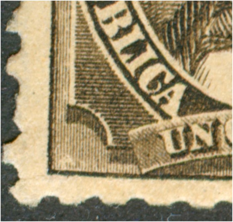
The 1889 definitives printed in recess by the CSBB have the 1c and 5c in TWO different designs!
Referring to them as by types is one of the great mistakes in Argentina philately! Due to their resemblances when observed from a distance and the problem catalogues had in depicting stamps according to reality.... And refusing to devote more space to enlargements which would make everything clear to the collectors!
1c Vélez Sársfield
Design 1

Design 2
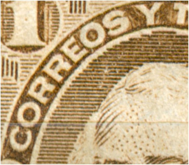
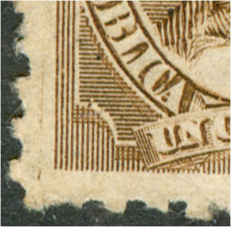
There is no way of getting from design 1 to design 2 by changing a few details as probably had been done in the case of the above mentioned definitives of 1923 and 1935! The density of the vertical lines differs, the cross-hatching, the space in front of UN etc.
to be continued ...
Referring to them as by types is one of the great mistakes in Argentina philately! Due to their resemblances when observed from a distance and the problem catalogues had in depicting stamps according to reality.... And refusing to devote more space to enlargements which would make everything clear to the collectors!
1c Vélez Sársfield
Design 1


Design 2


There is no way of getting from design 1 to design 2 by changing a few details as probably had been done in the case of the above mentioned definitives of 1923 and 1935! The density of the vertical lines differs, the cross-hatching, the space in front of UN etc.
to be continued ...
- Rein
- Usuario Colaborador

- Mensajes: 6258
- Registrado: 13 Mar 2009 15:59
- Ubicación: Leiden, Netherlands
- Contactar:
Re: Design or type - tamaño o tipo?
A recent discussion of an intermediate type is just ridiculous! Let's hope that Göttig and Jalil have some sense of nomenclature! What is shown in the middle is not even a subtype of design 1!
to be continued ...patagonian» 01 Nov 2011 00:25 escribió:El criterio aplicado por Beto es el correcto; en realidad lo más definitorio es la presencia o ausencia de marco; en el caso de fondo cuadriculado se producen por desgaste de la plancha una serie de estados transicionales al quedar ciertas áreas del fondo con el rayado horizontal solamente.
En el próximo catálogo GJ se incluirá una variedad intermedia entre las mencionadas.

Re: Design or type - tamaño o tipo?
Rein:
I´m in complete agreement with you. I think taxonomy is too much for the general collector but accept that one thing is type and the other is a different design. It happens that sometimes the difference is very subtle and tradition makes easier the use of types instead of designs. For instance I`ll mention a case of "my own harvest". The 1945 5c San Martín red. The design
for the typo printed is just not the same used for the offset. If you care to compare the design of laurel leaves above centAVOS
you`ll see what I mean, Catalogs do not show such difference. Saludos,
José
- Rein
- Usuario Colaborador

- Mensajes: 6258
- Registrado: 13 Mar 2009 15:59
- Ubicación: Leiden, Netherlands
- Contactar:
Re: Design or type - tamaño o tipo?
José,Otin escribió:Rein:
I´m in complete agreement with you. I think taxonomy is too much for the general collector but accept that one thing is type and the other is a different design. It happens that sometimes the difference is very subtle and tradition makes easier the use of types instead of designs. For instance I`ll mention a case of "my own harvest". The 1945 5c San Martín red. The design
for the typo printed is just not the same used for the offset. If you care to compare the design of laurel leaves above centAVOS
you`ll see what I mean, Catalogs do not show such difference. Saludos,
José
yes I had noticed that a long time ago and published the two "types" and somewhat later the broken stairs of the offset-litho version as well!
I think that we should ALWAYS have separate lines of types when two or more methods of printing are involved!
So I have the 10c Rivadavia in types I-IV for the typography and type A-C for the offset-litho! Never mix them!!!!!
For the 5c JSM the typography has just type I and the offset-litho have type A and type B [broken stairs at the right]!
Catalogues OUGHT to show us in a very clear way the differences!
saludos, Rein